-
Interactive DashboardsCreate interactive BI dashboards with dynamic visuals.
-
End-User BI ReportsCreate and deploy enterprise BI reports for use in any vertical.
-
Narrative Data StoriesThe Next Evolution of Data Storytelling
-
Visual Data Pipeline BuilderDesign Complex Data Flows, Simply.
-
Wyn ArchitectureA lightweight server offers flexible deployment.
-
 Wyn Enterprise 7.1 is ReleasedThis release emphasizes Wyn document embedding and enhanced analytical express...
 -
 Choosing an Embedded BI Solution for SaaS ProvidersAdding BI features to your applications will improve your products, better serve your customers, and more. But where to start? In this guide, we discuss the many options.
-
Visual GalleryInteractive sample dashboards and reports.
-
BlogExplore Wyn, BI trends, and more.
-
WebinarsDiscover live and on-demand webinars.
-
Customer SuccessVisualize operational efficiency and streamline manufacturing processes.
-
Knowledge BaseGet quick answers with articles and guides.
-
VideosVideo tutorials, trends and best practices.
-
WhitepapersDetailed reports on the latest trends in BI.
-
 Choosing an Embedded BI Solution for SaaS ProvidersAdding BI features to your applications will impr...
 -

Maps in WynDashboards
WynDashboards provides several map visuals to support diverse location-based data analysis scenarios.
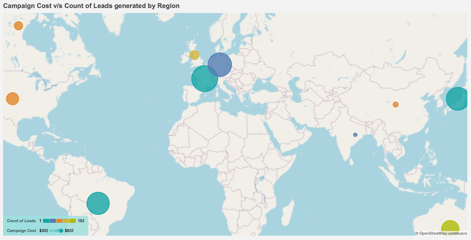
Bubble Map
A Bubble map employs size and/or color to show variations in measure magnitudes among different map points or regions. It’s useful for metrics like regional sales, entity counts, and more.
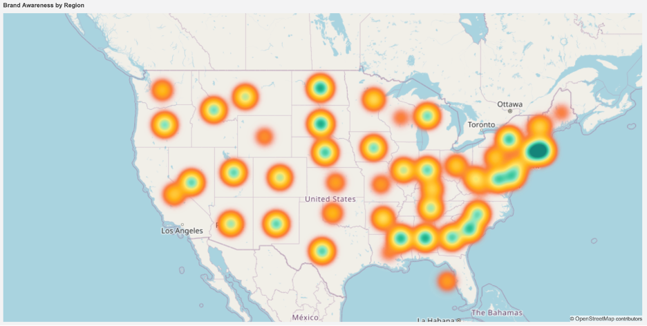
Heat Map
A Heat Map displays data on a map using colors to indicate high and low density areas. It measures data point density within a specific geographic radius.
Flow Line Map
A Flow Line Map shows movement and measure magnitude between geographic locations, like commodity exports or item distribution. It employs color and/or size to represent the analyzed measure.

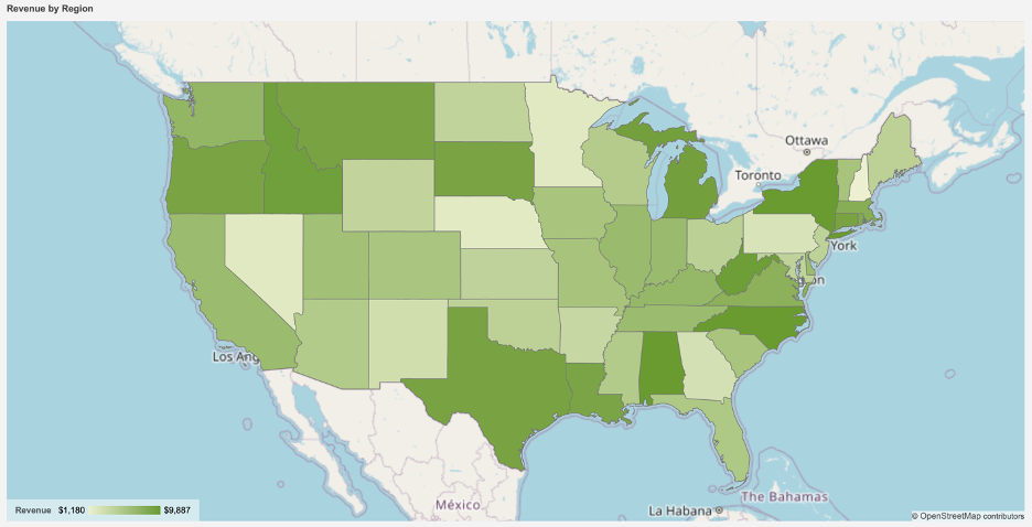
Area Map
Area Maps employ colors to visualize measures across geographical regions, highlighting significant areas such as those with high sales, low disaster impact, ample transport for manufacturing, and more.


Loved by industry
experts and real users