-
Interactive DashboardsCreate interactive BI dashboards with dynamic visuals.
-
End-User BI ReportsCreate and deploy enterprise BI reports for use in any vertical.
-
Spreadsheet AnalyticsNewLast-Mile Analytics Tool.
-
Narrative Data StoriesThe Next Evolution of Data Storytelling
-
Automated Business DocumentsNewDocument Generation for Smarter Workflows
-
Visual Data Pipeline BuilderDesign Complex Data Flows, Simply.
-
Wyn ArchitectureA lightweight server offers flexible deployment.
-
 Wyn Enterprise 7.1 is ReleasedThis release emphasizes Wyn document embedding and enhanced analytical express...
 -
 Choosing an Embedded BI Solution for SaaS ProvidersAdding BI features to your applications will improve your products, better serve your customers, and more. But where to start? In this guide, we discuss the many options.
-
Visual GalleryInteractive sample dashboards and reports.
-
BlogExplore Wyn, BI trends, and more.
-
WebinarsDiscover live and on-demand webinars.
-
Customer SuccessVisualize operational efficiency and streamline manufacturing processes.
-
Knowledge BaseGet quick answers with articles and guides.
-
VideosVideo tutorials, trends and best practices.
-
WhitepapersDetailed reports on the latest trends in BI.
-
 Choosing an Embedded BI Solution for SaaS ProvidersAdding BI features to your applications will impr...
 -

Wyn Enterprise offers a series of in-house custom visualizations, built by our team, for public availability. Dashboard authors can use these custom visualizations as a fresh new way to bring their data to life.
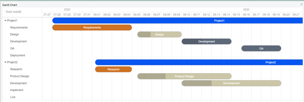
The Gantt chart is the newest data visualization in our custom collection. A Gantt chart is a bar chart that provides a visual view of tasks scheduled over a period of time. Gantt charts are most commonly used in project management and are among the most popular and practical ways of showing activities (tasks or events) displayed against time.
On a Gantt chart, you can easily see the following at a glance:
- Projects and their sub-tasks
- The start date of each project
- When tasks start and finish
- How long will each task take
- What tasks overlap and for how long
- The progress of each task
- The finish date of each project
On the left of the chart (Y-axis) is a list of the projects and tasks/activities and along the top (X-axis) is a suitable time scale. Each task/activity is represented by a bar; the position and length of the bar reflect the start date, duration, and end date of the task/activity.
Working with Gantt Chart Visualization
Here’s a quick demo exploring Gantt Chart custom visualizations. We’ll show you how to implement them in a Wyn dashboard.
Get the Gantt Chart from Github
Get the Gantt Chart from Github
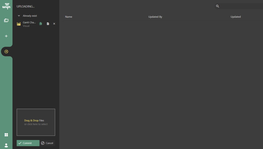
1. Download the Gantt chart visualization from our GitHub repository.
2. Upload the Gantt Chart.viz file on Wyn server through the Resource Portal.
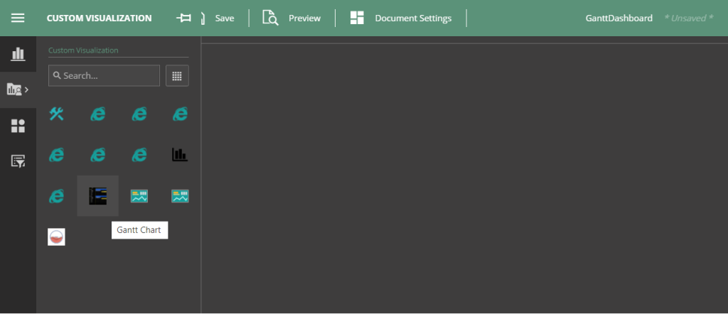
3. Create a new dashboard and drag and drop the Gantt chart visualization from the Custom Visualizations tab.
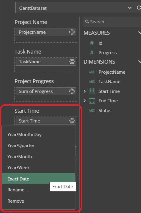
4. Bind data to the Gantt chart using fields from the Dataset as below:
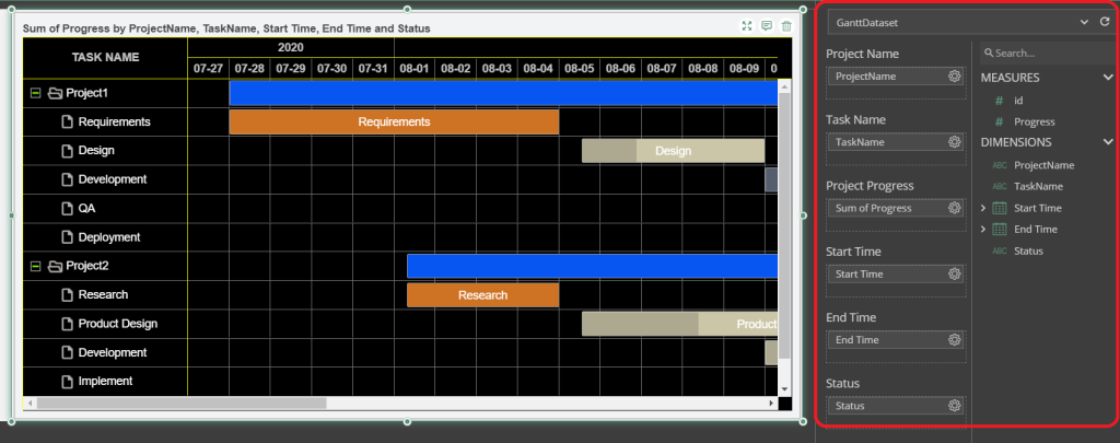
Important note – The format of the Start Time and End Time fields must be set to ‘Exact Date’ to show the data.
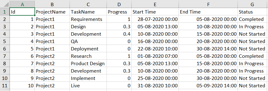
The structure of the Datasource used is as follows:
5. Once the data is bound, you can make changes to the Gantt chart’s appearance from the Inspector panel (color palette, background, etc.).
6. Preview the dashboard.
Running Gantt Chart directly from the downloaded package:
- The steps to run the Gantt chart custom visualization from the downloaded package directly are as follows:
- Install wyn-visual-tools globally. Run’ npm install @grapecity/wyn-visual-tools -g’ from the command prompt.
- Change the directory to the sample’s location and run ‘npm install’ to install all required modules.
- Run’ wyn-visual-tools develop’ to start the development server.
- Open the Wyn Enterprise portal in your browser. Go to the Admin Portal -> Dashboards Settings and enable developer mode.
- Go back to the Documents Portal and create a new dashboard. Then, add a “Dev Tools” scenario from the Custom Visualization tab onto the dashboard design surface.
- Develop your custom visualization using visual API. We recommend developing it using TypeScript.
- Click the Refresh button on the action bar of the Dev Tool visualization to reload the visualization.
To generate the .viz file:
- Update the version in package.json and visual.json before release.
- Pack the visual with build tools. Run’ wyn-visual-tools package’. This command will generate a file with “.viz” extension. This is the custom visualization which will be uploaded to Wyn.
- Upload the .viz file to Wyn Enterprise using the Resource Portal.
- The visual will now appear under Custom Visualizations in the Dashboard Designer.
Add Custom Visualizations in your BI Reports and Dashboards
Provide your team with a unified, enterprise-level, self-service data analysis and decision support platform. Wyn Enterprise is a web-based BI and data analytics platform that provides greater insight into your data.
Wyn’s easy-to-use designers allow non-technical business users to build interactive dashboards with drill-down and cross-filter functionality quickly.
Watch a Demo Video Test Drive Wyn

Abdias Michael
A veteran of the technical team, Senior Software Engineer Abdias Michael loves working with new technologies and focusing on providing quality solutions to customers. In his spare time, he enjoys traveling, playing guitar, and badminton. He has a Bachelor of Engineering degree from Dronacharya College of Engineering. You can find him on Twitter at @abdiasm.


Loved by industry
experts and real users


