-
Interactive DashboardsCreate interactive BI dashboards with dynamic visuals.
-
End-User BI ReportsCreate and deploy enterprise BI reports for use in any vertical.
-
Spreadsheet AnalyticsNewLast-Mile Analytics Tool.
-
Narrative Data StoriesThe Next Evolution of Data Storytelling
-
Automated Business DocumentsNewDocument Generation for Smarter Workflows
-
Visual Data Pipeline BuilderDesign Complex Data Flows, Simply.
-
Wyn ArchitectureA lightweight server offers flexible deployment.
-
 Wyn Enterprise 7.1 is ReleasedThis release emphasizes Wyn document embedding and enhanced analytical express...
 -
 Choosing an Embedded BI Solution for SaaS ProvidersAdding BI features to your applications will improve your products, better serve your customers, and more. But where to start? In this guide, we discuss the many options.
-
Visual GalleryInteractive sample dashboards and reports.
-
BlogExplore Wyn, BI trends, and more.
-
WebinarsDiscover live and on-demand webinars.
-
Customer SuccessVisualize operational efficiency and streamline manufacturing processes.
-
Knowledge BaseGet quick answers with articles and guides.
-
VideosVideo tutorials, trends and best practices.
-
WhitepapersDetailed reports on the latest trends in BI.
-
 Choosing an Embedded BI Solution for SaaS ProvidersAdding BI features to your applications will impr...
 -

With business intelligence dashboards, you can visualize and analyze real-time data that delivers actionable insights. Embedded BI refers to integrating business intelligence tools such as dashboards and reports natively into your software application.
When you embed BI dashboards within your own applications, you provide self-service capabilities for your end-users.
There are many benefits of embedding BI into your apps. The most significant reason to integrate an embedded BI tool is that business users can create and customize BI dashboards without having to leave a familiar environment they know how to use.
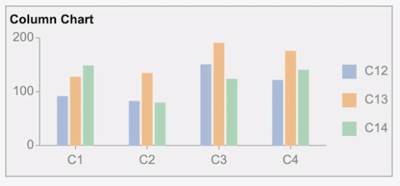
Column Charts in Business Intelligence Dashboards
A column chart is a common data visualization where each category is represented by a rectangle, with the rectangle’s height being proportional to the values being plotted.
There are several variations on the column chart:
- Column Chart
- Range Column Chart
- Stacked Column Chart
- Percent Stacked Column Chart
Here, we’ll create and customize each column chart in a Wyn Enterprise dashboard.
How to Create a Basic Column Chart
A basic Column Chart is used to compare categorical data through the use of vertical bars, where the length of each bar represents the value of the corresponding category.
A basic column chart is used to compare categorical data through the use of vertical bars, where the length of each bar represents the value of the corresponding category.
From the Wyn Dashboard interface, select the visualizations icon.
- Click and drag the “Column Chart” onto the Dashboard canvas.
- With the scenario selected, toggle to the Data Binding tab, select the dataset.
- Once the dataset is successfully loaded in the designer, the data binding panel automatically expands and displays the data attributes available in the dataset.
- Drag and drop the data attributes to the fields in the data binding area of the scenario, the chart plots accordingly, with a default title in the design area.
- Once you are done, you can select the “Inspector” tab and customize the visual settings for the title, color, spacing, grid line, and other options.
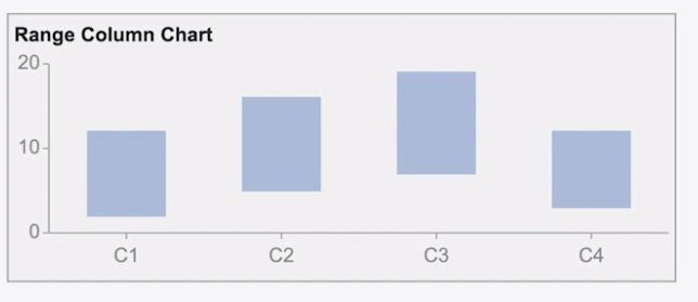
How to Create a Range Column Chart
The Range Column Chart is similar to a column chart where each bar represents the difference between the minimum and maximum values for each category.
From the Wyn Dashboard interface, select the visualizations icon.
- Click and drag the “Range Column Chart” onto the Dashboard canvas.
- With the scenario selected, toggle to the Data Binding tab, select the dataset.
- Once the dataset is successfully loaded in the designer, the data binding panel automatically expands and displays the data attributes available in the dataset.
- Drag and drop the data attributes to the fields in the data binding area of the scenario, the chart plots accordingly, with a default title in the design area.
- Once you are done, you can select the “Inspector” tab and customize the visual settings for the title, color, spacing, grid line, and other options.
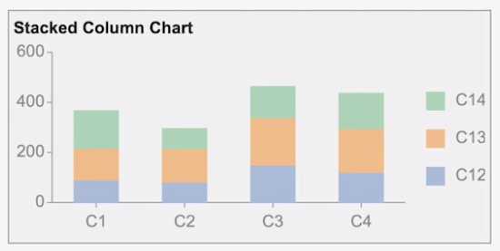
How to Create a Stacked Column Chart
The Stacked Column Chart is used to display the relationship of specific items to the whole, across different categories and plot values in two-dimensional vertical rectangles.
This chart stacks the data series in a vertical direction.
From the Wyn Dashboard interface, select the visualizations icon.
- Click and drag the “Stacked Column Chart” onto the Dashboard canvas.
- With the scenario selected, toggle to the Data Binding tab, select the dataset.
- Once the dataset is successfully loaded in the designer, the data binding panel automatically expands and displays the data attributes available in the dataset.
- Drag and drop the data attributes to the fields in the data binding area of the scenario, the chart plots accordingly, with a default title in the design area.
- Once you are done, you can select the “Inspector” tab and customize the visual settings for the title, color, spacing, grid line, and other options.
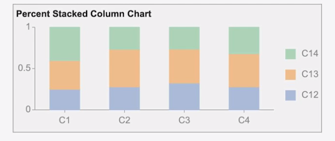
How to Create a Percent Stacked Column Chart
The Percent Stacked Column Chart is used to perform comparisons of percentages that each of the values are contributing to the total, across all your categories in the spreadsheet.
This chart stacks the data series vertically and also equalizes the plotted values to meet 100%. The plotted values are displayed in two-dimensional rectangles.
From the Wyn Dashboard interface, select the visualizations icon.
- Click and drag the “Stacked Column Chart” onto the Dashboard canvas.
- With the scenario selected, toggle to the Data Binding tab, select the dataset.
- Once the dataset is successfully loaded in the designer, the data binding panel automatically expands and displays the data attributes available in the dataset.
- Drag and drop the data attributes to the fields in the data binding area of the scenario, the chart plots accordingly, with a default title in the design area.
- Once you are done, you can select the “Inspector” tab and customize the visual settings for the title, color, spacing, grid line, and other options.
More About Embedded BI Dashboards
With embedded business intelligence dashboards, you can analyze data and deliver actionable information with interactive dashboards, multi-dimensional dynamic analysis, and intelligent drilling.
If you are vetting embedded BI solutions, take a look at Wyn Enterprise and our interactive dashboard and BI report gallery.
You can schedule a demo here to speak with a Wyn expert to address your specific BI requirements.
Better Data Insights = Better Decisions
Let us show you how Wyn Enterprise can provide greater insights into your data.
Learn how to make data insights more attainable, actionable, and valuable. ↓


Laurie Smith
Laurie A. Smith is the Product Marketing Manager for Wyn Enterprise. She managed content development at the Developer Tools Division before moving to the Wyn Enterprise Business Intelligence Team. Laurie holds an MFA in Film and Digital Media Production from Chatham University, an MBA & a Master’s Degree in Journalism and Mass Communications from Point Park University in Pittsburgh, PA.
In addition to working in technology, she also loves beekeeping, the horror movie genre, and carefully cultivating sunflowers.
Find her on LinkedIn.


Loved by industry
experts and real users


