-
Interactive DashboardsCreate interactive BI dashboards with dynamic visuals.
-
End-User BI ReportsCreate and deploy enterprise BI reports for use in any vertical.
-
Spreadsheet AnalyticsNewLast-Mile Analytics Tool.
-
Narrative Data StoriesThe Next Evolution of Data Storytelling
-
Automated Business DocumentsNewDocument Generation for Smarter Workflows
-
Visual Data Pipeline BuilderDesign Complex Data Flows, Simply.
-
Wyn ArchitectureA lightweight server offers flexible deployment.
-
 Wyn Enterprise 7.1 is ReleasedThis release emphasizes Wyn document embedding and enhanced analytical express...
 -
 Choosing an Embedded BI Solution for SaaS ProvidersAdding BI features to your applications will improve your products, better serve your customers, and more. But where to start? In this guide, we discuss the many options.
-
Visual GalleryInteractive sample dashboards and reports.
-
BlogExplore Wyn, BI trends, and more.
-
WebinarsDiscover live and on-demand webinars.
-
Customer SuccessVisualize operational efficiency and streamline manufacturing processes.
-
Knowledge BaseGet quick answers with articles and guides.
-
VideosVideo tutorials, trends and best practices.
-
WhitepapersDetailed reports on the latest trends in BI.
-
 Choosing an Embedded BI Solution for SaaS ProvidersAdding BI features to your applications will impr...
 -

Whatever type of manufacturing operation you look at batch, continuous, or process — they have two things in common: they are complicated, and they are dynamic. Everything is measured, but despite investing fortunes in ERP and MES, most factory floors actually run on whiteboards and spreadsheets.
Measurement comes before improvement. That’s why many factories are awash with metrics. Yields, scrap, schedule attainment, and availability are just a few of the many measures.
Manufacturing organizations utilize business intelligence to track metrics and KPIs. Overall equipment effectiveness (OEE) measures the productivity of a manufacturing organization. Here, we’ll create an OEE manufacturing BI dashboard to identify the percentage of productive manufacturing time for an organization operating in multiple shifts.
Business Intelligence Dashboards for Manufacturing
Business intelligence dashboards allow executives to track metrics and KPIs.By tracking metrics, you will derive insights on the processes, and by making slight improvements to the process, you can potentially save millions of dollars. With multi-language BI tools, manufacturers can also ensure their global teams interpret dashboards consistently across regions.
Among many metrics, OEE is one of the important manufacturing metrics that highlight the manufacturing productivity of an organization. By measuring OEE, management gains important insights on how to systematically improve the manufacturing process. OEE is the single good metric for identifying losses, benchmarking progress, and improving the productivity of manufacturing equipment (i.e., eliminating waste).
An OEE manufacturing dashboard highlights the overall equipment effectiveness and its associated KPIs that identify the percentage of productive manufacturing time for an organization operating in multiple shifts. Modern solutions often come as an embedded business intelligence solution, seamlessly integrated into ERP and MES systems to avoid manual workarounds.
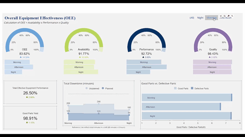
An OEE Manufacturing Dashboard – Wyn Enterprise
View Additional Interactive Dashboards →
Process Temperature Manufacturing Dashboard →
Manufacturing KPIs
In any OEE dashboard, the spotlight is almost always on three important KPIs represented by gauges on this sample.
Manufacturing OEE KPI #1 – Availability
This KPI takes into account the time for which the equipment was available for production after leaving out the unplanned stops and planned stops.
The ratio of actual run time to the planned production time gives an idea of the potential of the equipment.
| Available Time | 1440 mins |
| Planned Stops | 50 mins |
| Net Run Time | 1440-50 = 1390 mins |
| Unplanned Stops | 400 mins |
| Actual Run Time | 1390-400 = 990 mins |
Availability = 990/1390 = 0.71 or 71%
The above example shows a good ratio that means the equipment is not very prone to frequent breakdowns or does not demand high maintenance.
Manufacturing OEE KPI #2 – Performance
It is a measure of net process or production cycle run time against its full capability. It is calculated as (Production Cycle time * Total pieces)/Run Time.
The production cycle is the time equipment should take to produce one unit.
For example:
| Planned Production Cycle | 15 units/min |
| Run Time | 900 mins |
| Planned Units | 15*990 = 14850 |
| Actual Units | 12000 |
Performance = 12000/14850 = 0.8 or 80%
The resultant figure shows an efficient manufacturing process where the capacity of a plant, equipment & personnel, is effectively being used with a scope of improvement.
Manufacturing OEE KPI #3 – Quality
This highlights the count of manufactured parts that meet quality standards. This is because not all units can meet the quality specifications.
The quality factor is calculated as a ratio of Quality Units to the Total Units produced. If 10000 units are good units out of 12000 total units produced, the Quality factor would be:
Quality = 10000/12000 = 0.87 or 87%
As you may noticed that all the three factors can be valid independently though to get a complete picture, OEE is calculated by multiplying the 3 above factors. For example,taking the values from the above factors:
OEE = 0.710.80.87 = 0.49 or 49%
Please note that collating the data is one thing, but making sense of all that noise and retrieving the insights/analysis is a challenge.
One way organizations can overcome this is by making use of data visualizations. e.g. considering the Performance and Quality metrics in a single frame throws an interesting analysis here.
The Performance KPI seems to be a high percentage and does look good on the reports/dashboard, however, the manager should be making sure that the quality is not being compromised in an attempt to improve the performance percentage.
The Wyn Enterprise OEE dashboard highlights the data visualizations to capture OEE and other factors for a manufacturing process.
You can see the KPIs and charts displaying the utilization and production capacity of multiple shifts. With flexible deployment, Wyn also supports self-service BI without user fees, allowing unlimited users across the plant to monitor dashboards and reports at no additional cost.
The Overall Equipment Effectiveness Dashboard
The important visualizations in the dashboard are the gauges that are used to indicate the OEE and other factors over a time frame for multiple shifts.
The four gauges display individual achievements for the factors respectively spanning multiple shifts.
The gauges chart helps to display the single measure effectively on a scale and shows the progress of the KPI clearly. The information can be broken down on a single shift as well.
Total Effective Equipment Performance (TEEP) & Good Parts
Simply speaking, TEEP is the overall production effectiveness of the organization, the true capacity. It is calculated by multiplying OEE by Utilization.
| Planned Production Time | 108 hrs (6 hrs*3 shifts*6 days) |
| Total Time available | 168 hrs (24 hrs*7 days) |
| Utilization | 108/168 = 64% |
| OEE | 49% |
TEEP = 0.64*0.49 = 0.31 or 31%
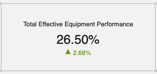
One may notice the use of a KPI chart that is helpful to quickly inform the user about the overall performance of an organization or operation. Here, a manager can quickly refer to the potential of increasing throughput with the current equipment.
Usually, the KPIs are accompanied by another chart or KPI to give context to overall KPI data. As you may notice the other KPI in this sample dashboard displaying the number of good quality units produced.
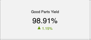
Observing the above two KPIs independently pretty much hand out useful information in their own context. The organization is producing an excellent quantity of good units and thereby less wastage of raw material and there is room for increasing the output too. It seems to be a very straightforward position to be in as you tell your plant manager to increase the working hours or number of shifts to increase the utilization or running time of the machines.
Now let’s put both the KPIs together and you may notice that you are already achieving high throughput with the current production time. Would you like to run a risk of disturbing the quality of the units or longevity of the equipment by increasing their run time?
Probably not.
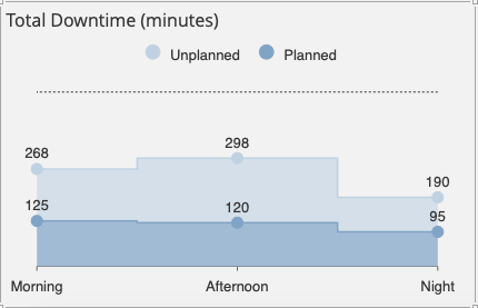
Alongside the KPI charts, we can notice the stacked area chart that is used to display the comparison between the unplanned and planned stoppage of the equipment. These stoppages can arise due to scheduled maintenance or unexpected equipment failure.
Stacked area charts are useful to plot multiple variables changing over an interval if a user is looking for any patterns.
Quality of Parts Produced
Another important metric for any successful manufacturing process is the quality of production. Quality units are a vital factor that can up the revenue for a company.
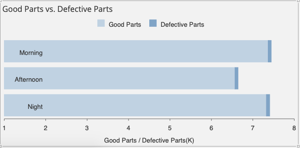
The use of a simple stacked bar graph helps a user to compare the number of quality units against the defective units produced.
The visualization is helpful in cases where it is required to display proportions.
What is an OEE Dashboard?
An OEE (Overall Equipment Effectiveness) dashboard is a real-time visualization tool that measures how efficiently manufacturing equipment is being used. It consolidates key performance metrics – availability, performance, and quality – into a single, easy-to-read interface. By tracking these metrics, manufacturers can identify production bottlenecks, reduce downtime, and improve output consistency. Unlike static reports, an OEE dashboard updates continuously, giving plant managers and operators immediate insights to make data-driven decisions on the shop floor. This proactive approach not only boosts productivity but also supports long-term operational excellence.
OEE Dashboard Analysis
OEE dashboards equally assist the upper management and floor managers/supervisors in keeping a tab on the processes and productivity of the organization.
A user can keep track of Availability, Performance, and the Quality of the units produced in a single shift or multiple shifts. Managers can analyze the reasons behind the KPI figures of one shift over the other and act accordingly.
View Additional Interactive Dashboards →
Process Temperature Manufacturing Dashboard →
FAQ: Business Intelligence Dashboards & OEE for Manufacturing
1. What is an OEE dashboard and why is it important for manufacturers?
An OEE dashboard (Overall Equipment Effectiveness dashboard) is a real-time visual tool that helps manufacturers track and improve the performance, availability, and quality of their equipment. By monitoring OEE, teams can quickly spot inefficiencies, reduce downtime, and optimize productivity across the production line.
2. How does business intelligence for equipment dealers enhance operational decision-making?
Business intelligence for equipment dealers provides powerful analytics on equipment sales, utilization, service history, and performance. BI dashboards help dealers make data-driven decisions about inventory, maintenance schedules, and customer support, ultimately driving higher profitability and customer satisfaction.
3. What are the key metrics tracked on an overall equipment effectiveness dashboard?
An overall equipment effectiveness dashboard tracks three main metrics: availability, performance, and quality. Together, these provide a comprehensive view of how well manufacturing equipment is running, allowing companies to identify areas for improvement and benchmark production efficiency.
4. How do manufacturers use dashboards to reduce equipment downtime?
Dashboards visualize equipment downtime, root causes, and trends over time. By monitoring these metrics, maintenance teams can implement proactive strategies, schedule timely repairs, and minimize unexpected breakdowns that disrupt operations.
5. Can BI dashboards help with predictive maintenance in manufacturing?
Yes, business intelligence dashboards analyze sensor data and historical maintenance records to predict when equipment might fail. This enables manufacturers to perform maintenance only when needed, reducing costs and extending equipment lifespan.
6. What are the benefits of embedding BI dashboards on the plant floor?
Embedding BI dashboards on the plant floor provides operators with real-time performance data, instant alerts, and actionable insights. This empowers frontline teams to respond quickly to issues and drive continuous process improvements.
7. How do dashboards support quality control in manufacturing?
Dashboards track defect rates, quality scores, and inspection results, making it easier for managers to identify recurring issues and implement corrective actions. Visualizing quality data ensures a consistent and high-quality manufacturing process.
8. How does OEE benchmarking help manufacturers stay competitive?
OEE benchmarking lets manufacturers compare their equipment effectiveness against industry standards or internal targets. This helps identify gaps, set realistic goals, and drive ongoing improvement in operational efficiency.
9. Can manufacturing BI dashboards integrate with ERP and MES systems?
Yes, modern BI dashboards connect seamlessly with ERP (Enterprise Resource Planning) and MES (Manufacturing Execution Systems), ensuring that all data sources are unified for holistic analysis and reporting.
10. Why choose Wyn Enterprise for manufacturing business intelligence dashboards?
Wyn Enterprise delivers customizable, real-time dashboards for OEE and manufacturing KPIs. Its embedded analytics, unlimited user licensing, and integration with existing plant systems empower manufacturers to boost productivity, quality, and data-driven decision-making. The real-time data analytics and data monitoring further enable hands-off and in-the-moment reporting of shop floor performance and alerts.

Nitin Gupta
Nitin Gupta has experience working in several roles with the organization, ranging from technical support to sales. Nitin is now working towards a Product Manager role. He is a business management graduate from ICFAI. In his free time, Nitin enjoys open-wheel racing & binging on short films. You can connect with him on Twitter.


Loved by industry
experts and real users


