-
Interactive DashboardsCreate interactive BI dashboards with dynamic visuals.
-
End-User BI ReportsCreate and deploy enterprise BI reports for use in any vertical.
-
Wyn AlertsSet up always-on threshold notifications and alerts.
-
Localization SupportChange titles, labels, text explanations, and more.
-
Wyn ArchitectureA lightweight server offers flexible deployment.
-
 Wyn Enterprise 7.1 is ReleasedThis release emphasizes Wyn document embedding and enhanced analytical express...
 -
 Choosing an Embedded BI Solution for SaaS ProvidersAdding BI features to your applications will improve your products, better serve your customers, and more. But where to start? In this guide, we discuss the many options.
-
Visual GalleryInteractive sample dashboards and reports.
-
BlogExplore Wyn, BI trends, and more.
-
WebinarsDiscover live and on-demand webinars.
-
Customer SuccessVisualize operational efficiency and streamline manufacturing processes.
-
Knowledge BaseGet quick answers with articles and guides.
-
VideosVideo tutorials, trends and best practices.
-
WhitepapersDetailed reports on the latest trends in BI.
-
 Choosing an Embedded BI Solution for SaaS ProvidersAdding BI features to your applications will impr...
 -

Today, organizations are faced with more data than ever before. Gathering, organizing, maintaining, and visualizing that data is becoming increasingly difficult in every industry.
In many cases, users must visualize data points that are not immediately available in their database. For example, a user wants to show the relationship between profitability percentage and store size but does not have a defined field for profitability percentage. The user must create a new dynamic aggregation and use that calculated field for the visualization.
The WynDashboards new Calc Chart feature offers a powerful Excel-like spreadsheet that allows users to perform dynamic data aggregations.
Outlined below is a real-world use-case featuring a sample retail sales database and the WynDashboards Calc Chart.
Adding the Calc Chart Visualization to a Dashboard
Add the Calc Chart from the Data Visualization toolbox. The Calc Chart has its own section in the toolbox at the bottom, as shown below.

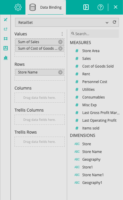
Once the chart is added to the dashboard design surface, the Data Binding panel is displayed automatically on the immediate right-hand side of the visual.
This panel displays various options for customizing the visualization. Click the pencil icon (Edit Custom Dataset) to edit the data.
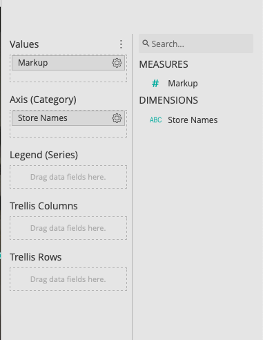
The UI layout consists of three parts:
- Left panel: displays the unaggregated data as a pivot table
- Right panel: displays the spreadsheet, which references the pivot table and performs calculations
- Bottom panel: displays the resulting chart once after the calculations are performed and bound to the visual
Preparing the Pivot Table
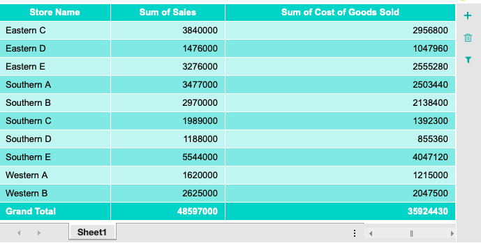
The purpose of the pivot table within the Calc Chart is to provide the data and aggregations of that data to be used for calculating the custom values.
Once the user clicks “Edit Custom Dataset,” they can assign a dataset to the Calc Chart and then drop fields into the data buckets to create the pivot table.
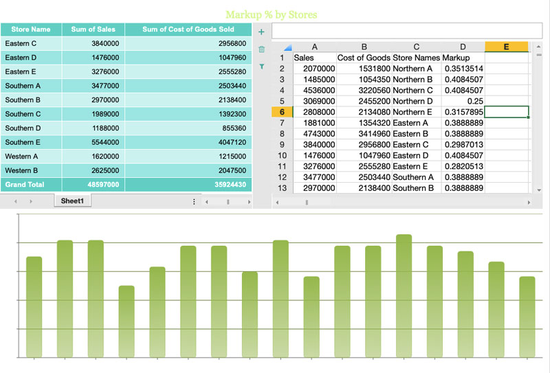
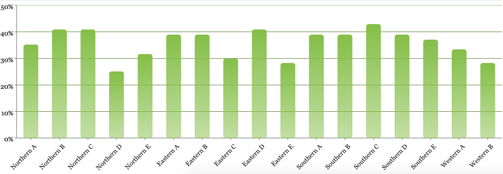
For this sample, we will create a column chart that displays mark-up percentage by store. Mark-up percentage is a commonly used field in retail that allows store managers to calculate their profitability. In our sample dataset, we do not have mark-up percentages as an available field, so we need to calculate it in the Calc Chart. Mark-up percentage is calculated as (sales – the cost of goods sold)/cost of goods sold.
To calculate this value by store, distribute the following fields into the data buckets as follows:
Once the fields are bound to the pivot table, the result appears as below. The last row displays the sum total aggregation. This pivot table will act as the \”ad hoc\” data source for the Calc Chart.
For advanced use-cases, the Calc Chart allows users to add multiple pivot tables, which the spreadsheet can reference to calculate more advanced custom measures.
Configuring the Data Binding
The next step is to configure and calculate the data for the visual. This can be done in two different ways.
- Manual: type any value directly into the cells
- This is helpful for defining a column header or other static text to help keep things organized in the spreadsheet
- Reference: reference the data in the pivot table dynamically using the “GetPivotData” formula
- To create the formula automatically (recommended), click in the formula bar, then the cell in the pivot table
This sample uses the “GetPivotData” formula to retrieve the sales column values and cost of goods sold column values from the pivot table and insert them into the spreadsheet.
Note: only the pivot table value cells can be dynamically referenced. Any reference to row/column data needs to be inserted manually or copied/pasted from the pivot table.
This sample shows values copied from the stores column of the pivot table and pasted into the spreadsheet. The end result is a dynamic reference to the sales and cost of goods sold values, broken down by a static, store names column.
Make use of the formula bar and perform the desired calculations on the pivot data as this example shows by calculating the markup values.
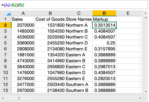
Now that the spreadsheet has all the required fields and data, calculate the mark-up percentage. Click in the formula bar and type your expression.
In this sample, the expression to calculate mark-up percentage is \”=(A2-B2)/B2\”

Binding the Chart to the Calculated Fields
The selected data from the previous step now acts as the fields of the dataset used by the Calc Chart. The data binding panel on the right displays fields from the range selected as the data source in the spreadsheet.
Once the fields are dragged into the data buckets, the chart can be displayed.
Any future edits to data in the sheet will automatically update the data source and chart reflecting the latest updates.
Users can apply formatting on the Calc Chart with the inspector panel. Clicking the pencil icon again will exit the Calc Chart edit mode and return to the parent dashboard.
The Calc Chart offers a critical benefit to end-users. It addresses the requirement of calculating custom measures. This ensures that data not on the record level in the dataset can still be calculated and visualized in any dashboard.
This sample dashboard {link to the visual gallery where this sample should live} outlines how to create new dimensions by calculating on-demand sales metrics not available at the record level.
Watch an interactive sample in action here.
For questions about using Calc Charts in Wyn Enterprise 4.0, scheduling a demo, or finding out how Wyn can meet your BI requirements, please reach out to us at experts@wynenterprise.com.

Nitin Gupta
Nitin Gupta has experience working in several roles with the organization, ranging from technical support to sales. Nitin is now working towards a Product Manager role. He is a business management graduate from ICFAI. In his free time, Nitin enjoys open-wheel racing & binging on short films. You can connect with him on Twitter.


Loved by industry
experts and real users
Whether it’s your business or your commercial SaaS app, embed Wyn and empower users to design, share, and distribute interactive dashboards and reports.


