-
Interactive DashboardsCreate interactive BI dashboards with dynamic visuals.
-
End-User BI ReportsCreate and deploy enterprise BI reports for use in any vertical.
-
Spreadsheet AnalyticsNewLast-Mile Analytics Tool.
-
Narrative Data StoriesThe Next Evolution of Data Storytelling
-
Automated Business DocumentsNewDocument Generation for Smarter Workflows
-
Visual Data Pipeline BuilderDesign Complex Data Flows, Simply.
-
Wyn ArchitectureA lightweight server offers flexible deployment.
-
 Wyn Enterprise 7.1 is ReleasedThis release emphasizes Wyn document embedding and enhanced analytical express...
 -
 Choosing an Embedded BI Solution for SaaS ProvidersAdding BI features to your applications will improve your products, better serve your customers, and more. But where to start? In this guide, we discuss the many options.
-
Visual GalleryInteractive sample dashboards and reports.
-
BlogExplore Wyn, BI trends, and more.
-
WebinarsDiscover live and on-demand webinars.
-
Customer SuccessVisualize operational efficiency and streamline manufacturing processes.
-
Knowledge BaseGet quick answers with articles and guides.
-
VideosVideo tutorials, trends and best practices.
-
WhitepapersDetailed reports on the latest trends in BI.
-
 Choosing an Embedded BI Solution for SaaS ProvidersAdding BI features to your applications will impr...
 -

The Problem With Showing Data Without Explaining It
If you work in data analytics, you’ve probably heard this question more times than you’d like:
“Wait, what does this chart mean?”
You’ve spent hours connecting data sources, checking calculations, choosing the right visualizations, and building a dashboard. Everything looks good. The numbers are correct, and the charts show exactly what you wanted them to show.
Then someone opens the dashboard and asks you to explain it.
You start walking them through the numbers, explaining what each chart represents and pointing out the trends they should pay attention to. Before you know it, you’ve spent half an hour explaining something you thought was already clear.
Sound familiar?
The problem isn’t necessarily the dashboard. Dashboards are excellent at showing what’s happening in your business. But understanding what happened is only part of the picture.
Business leaders also need to understand why it happened, why it matters, and what they should do next.
A CEO looking at a drop in revenue doesn’t just want to know that sales are down. They want to understand what’s driving the decline and whether they need to change their strategy. A sales manager seeing an increase in customer churn needs more than a line on a chart. They need context to understand what’s going wrong and how to respond.
Without that context, even a well-designed dashboard can leave people with more questions than answers.
Data shows you what is happening. The story behind the data helps you understand what it means.
Why Charts Alone Don’t Always Tell the Whole Story
Imagine a dashboard showing a 15% revenue decline in Q2. The drop is clear, but what caused it?
Was it a particular region, a delayed product launch, or changing customer demand?
The analyst may already have the answers, but if those findings are buried in spreadsheets, emails, or separate reports, stakeholders are left to interpret the numbers themselves.
This disconnect leads to repeated explanations, unnecessary meetings, and slower decisions.
Why Not Just Put Everything in a Report?
One obvious solution is to combine charts with written explanations in a report. Instead of sending a dashboard on its own, you can explain your findings, highlight important changes, and recommend next steps.
That certainly helps. But it can also introduce another workflow.
You build the dashboard, export the charts, open another application, and combine everything into a document. Then, when the underlying data changes, you may need to update the visualizations and rewrite parts of the explanation.
Before long, you’re maintaining multiple versions of the same information across different tools.
Wouldn’t it be easier if the data, visualizations, calculations, and written narrative could live together in one place?
That’s the idea behind Narrative Data Stories.
What Are Narrative Data Stories?
Narrative Data Stories combine data visualizations with written explanations to help people understand analytical findings in context.
Instead of presenting charts and leaving readers to interpret them independently, you can guide them through the data, explain important trends, and connect the numbers to the questions that matter to the business.
With Wyn Notebooks, part of the Wyn Enterprise business intelligence platform, analysts can create document-like experiences that combine text, visualizations, datasets, and analysis in one place.
Think of it as bringing the explanation closer to the evidence.
A chart can show that revenue has declined. The accompanying narrative can explain which regions contributed most to the decline, what the analysis reveals, and which areas deserve further investigation.
Readers no longer have to switch between a dashboard and an email to understand the analyst’s findings. The explanation is presented alongside the data itself.
And because Wyn Notebooks work with connected business data, your analytical experience can be built around governed data rather than relying entirely on manually exported snapshots.
For a closer look at the concept, see our guide to Narrative BI with Wyn Notebooks.
Dashboard vs. Narrative Data Story: What’s the Difference?
Dashboards and Narrative Data Stories complement each other, but they serve different purposes.
| BI Dashboard | Narrative Data Story |
|---|---|
| Helps users monitor KPIs and performance | Guides readers through analytical findings |
| Highlights trends, patterns, and changes | Adds explanations and business context |
| Supports interactive data exploration | Combines visualizations with a structured narrative |
| Helps answer “What is happening?” | Helps explain “Why does it matter?” |
| Useful for ongoing performance monitoring | Useful for communicating analysis and conclusions |
A dashboard helps users discover what deserves attention. A Narrative Data Story helps analysts communicate what they’ve learned about it.
With Wyn Enterprise, organizations can use both approaches within the same BI platform.
From “What Happened?” to “What Should We Do Next?”
A dashboard can highlight a change in performance, but understanding what caused it often requires further investigation.
With Wyn Notebooks, analysts can bring that investigation into the same experience as the visualizations. They can explain which products, regions, or sales channels contributed to a trend, support their findings with relevant data, and identify areas that deserve attention.
This doesn’t mean the software automatically determines why something happened. Analysts still need to validate their findings and ensure their conclusions are supported by evidence.
What Wyn Notebooks provide is a way to communicate that analysis clearly, so readers can move from seeing a trend to understanding its business implications.
What Can You Include in a Narrative Data Story?
A useful data story is more than a chart with a paragraph underneath it. It brings together the elements readers need to follow an analysis from beginning to end.
With Wyn Notebooks, you can combine:
- Written explanations: Introduce the business question, explain important findings, and add context to the numbers.
- Interactive visualizations: Let readers explore trends and comparisons through the data.
- Datasets and analysis: Bring the underlying data into the same document-like experience as your narrative.
- AI-generated insights: Use wynAI Chat Analysis to generate and refresh narrative content from the underlying data, helping keep explanations aligned with changing figures.
- Embedded analytics: Make Narrative Data Stories available within your own application, so users can access insights in the environment where they already work.
These capabilities help analysts create more complete analytical experiences without having to assemble every element in a separate application.
Wyn Notebooks also support governed analytics, allowing organizations to build on the security and data governance capabilities of the wider Wyn Enterprise platform.
See Narrative Data Storytelling in Action
What does a Narrative Data Story look like in practice?
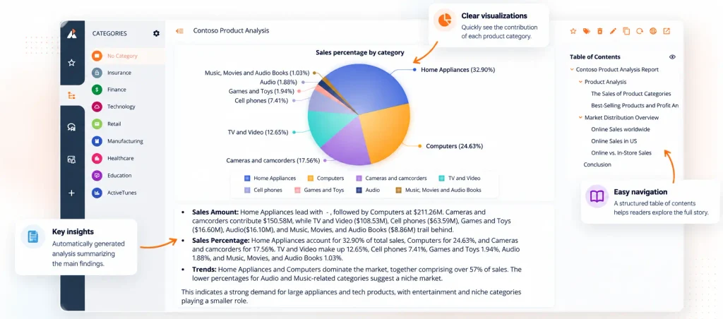
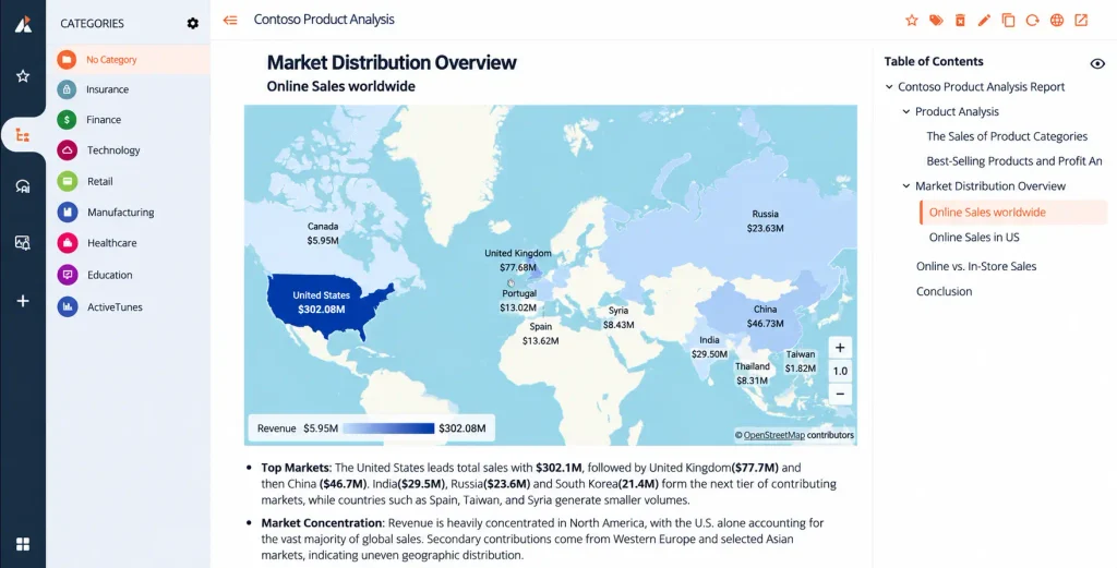
The Contoso Product Analysis Report, created with Wyn Notebooks, brings product performance, geographic sales data, and written analysis together in one structured document.
For example, its global online sales analysis shows the United States leading with $302.08 million, followed by the United Kingdom at $77.68 million and China at $46.73 million.
But the numbers are only part of the story. The accompanying analysis highlights how heavily online sales are concentrated in the U.S., helping readers understand the geographic distribution rather than simply comparing values on a map.
The Notebook also includes product-category analysis, online versus in-store sales comparisons, and a table of contents that guides readers through the findings.
Explore the Contoso Product Analysis Report
From sales figures to the full Contoso story
A chart can show where sales are strongest. A Narrative Data Story brings the visuals, regional findings, and written analysis together so readers can understand the bigger picture.
Top markets by online sales
Sales values from the Contoso Product Analysis Notebook.
Market distribution overview
The real geographic visualization from the Contoso Notebook.

- Top markets: The U.S. leads, followed by the U.K. and China; India and Russia are among the next largest markets shown.
- Market concentration: Online sales are unevenly distributed, with a particularly strong concentration in the United States.
Want to explore the Notebook yourself? Open the interactive example.
What Happens When Your Data Story Needs to Reach More People?
Creating a clear explanation is one part of the challenge. Making it available to the right people is another.
In many organizations, analytics is delivered through a separate BI portal, while employees and customers spend most of their time in other applications.
This is particularly relevant for SaaS providers and software companies that want to offer analytics as part of their own products.
With Wyn Enterprise, you can embed Wyn Notebooks into your application, bringing data stories directly into the experience your users already know. You can also customize the embedded experience to align with your application’s branding.
This means your users can explore visualizations and read the accompanying narrative without having to switch between your application and a separate analytics environment.
For organizations building embedded analytics experiences, this creates another way to deliver context alongside the data not just charts in isolation.
Learn more about Wyn Enterprise’s Narrative Data Stories and how they can be incorporated into your analytics experience.
The Next Step in Data Storytelling
The question “What does this chart mean?” isn’t going to disappear entirely. Business data can be complex, and people will always need to investigate unexpected results and ask follow-up questions.
But we can make those conversations more productive.
Instead of treating explanations as something that happens after a dashboard is built, we can make them part of how analytical findings are presented from the start.
That’s what Narrative Data Stories are designed to do.
With Wyn Notebooks, analysts can bring data, visualizations, and written context together to help people understand not just what happened, but why it matters and what the business might do next.
The goal isn’t to replace dashboards. It’s to make the insights they reveal easier to understand, communicate, and act on.
Because the real value of analytics isn’t simply showing people the numbers.
It’s helping them understand the story behind those numbers and make better decisions because of it.
See How It All Comes Together
Discover how Wyn Enterprise brings together dashboards, reports, data stories, spreadsheets, and business documents in one analytics platform.
Frequently Asked Questions
What is a Narrative Data Story?
A Narrative Data Story combines data visualizations with written explanations, analysis, and context. It helps readers understand what the data shows, why a finding matters, and what actions may be worth considering.
How are Narrative Data Stories different from BI dashboards?
BI dashboards primarily help users monitor performance, explore metrics, and identify trends. Narrative Data Stories add written context and structure, helping analysts explain findings and guide readers through an analysis. Both approaches can complement each other.
What are Wyn Notebooks?
Wyn Notebooks are a feature of Wyn Enterprise that lets users create narrative-style documents combining text, visualizations, datasets, and analysis. They help teams communicate insights in a connected, document-like experience.
Can Wyn Notebooks use live business data?
Yes. Wyn Notebooks can work with connected, governed business data through Wyn Enterprise. This allows analytical documents to draw on business data without depending entirely on manually exported charts and static snapshots.
Can AI help create Narrative Data Stories?
Yes. In Wyn Enterprise 9.1, wynAI Chat Analysis can generate and refresh narrative content from the underlying data in Wyn Notebooks. Analysts should still review AI-generated content to ensure the explanations are accurate and supported by the data.
Can I embed Wyn Notebooks into my own application?
Yes. Wyn Enterprise 9.1 supports embedding Notebooks into host applications using DIV integration. This allows organizations to deliver narrative-driven analytics within their own application experience.
Ready to Tell the Story Behind Your Data?
Your dashboards already show what’s happening. Give your users the context they need to understand why it matters.
Explore Wyn Notebooks and see how Narrative Data Stories can help you turn business data into clearer, more meaningful insights.
Request a Personalized Demo of Wyn Enterprise →

Enea Gega
Enea is a Technical Product Enablement Specialist for the Wyn Enterprise Platform. He acts as a vital bridge between customers, product teams, and engineering to ensure that every new feature delivers genuine value and drives user adoption.
Enea specializes in translating complex customer needs into actionable insights for product roadmaps and technical documentation. By partnering cross-functionally, he ensures seamless delivery readiness and alignment across all releases.


Loved by industry
experts and real users