-
Interactive DashboardsCreate interactive BI dashboards with dynamic visuals.
-
End-User BI ReportsCreate and deploy enterprise BI reports for use in any vertical.
-
Spreadsheet AnalyticsNewLast-Mile Analytics Tool.
-
Narrative Data StoriesThe Next Evolution of Data Storytelling
-
Automated Business DocumentsNewDocument Generation for Smarter Workflows
-
Visual Data Pipeline BuilderDesign Complex Data Flows, Simply.
-
Wyn ArchitectureA lightweight server offers flexible deployment.
-
 Wyn Enterprise 7.1 is ReleasedThis release emphasizes Wyn document embedding and enhanced analytical express...
 -
 Choosing an Embedded BI Solution for SaaS ProvidersAdding BI features to your applications will improve your products, better serve your customers, and more. But where to start? In this guide, we discuss the many options.
-
Visual GalleryInteractive sample dashboards and reports.
-
BlogExplore Wyn, BI trends, and more.
-
WebinarsDiscover live and on-demand webinars.
-
Customer SuccessVisualize operational efficiency and streamline manufacturing processes.
-
Knowledge BaseGet quick answers with articles and guides.
-
VideosVideo tutorials, trends and best practices.
-
WhitepapersDetailed reports on the latest trends in BI.
-
 Choosing an Embedded BI Solution for SaaS ProvidersAdding BI features to your applications will impr...
 -

When we talk to any business intelligence thought leader, you will hear them talking about the proverbial story that your data is telling you. BI analysts and data scientists alike strive to communicate the story using tools like models, interactive BI dashboards, reports, infographics, and a lot of other visualization media. In this post, I wanted to share what this “story” is all about. They say a story is a journey of a character… in this story of the data, who is the character? What is the plotline? What is the climax and where is the “twist” in the tale?
Let’s break it down and start with some definitions of the terminologies and processes commonly used in business intelligence.
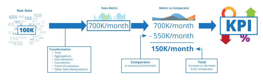
Data
This is a number or text that describes a property of a subject. This subject is what we are interested in understanding in more detail. This may be a place, a thing, a sales order, a customer, and so on.
Measures
A measure is a number or data value with a context of the property it is representing and is recorded at a point of time. For example, the temperature at different times of the day. The temperature is a property of the “air,” but the number alone (say 60) is not a measurement. We don’t know if it is in Celsius or Fahrenheit or even Kelvin. When we add context to the data number, we can use it to measure the property. So, 60 degrees Fahrenheit is a measure of the temperature.
Metric
Many people will use metrics and measures interchangeably, but they are not synonyms. While a measure is a representation of a property at a point in time, a metric is a collection of standardized measurements. This may be derived or calculated using a simple collection of measures. For example, staying with the temperature measure above, a metric derived from the measure would be the “real feel” temperature.
This considers a lot more context about the surroundings (read: “business context”), like wind speed, chill factor, etc. Adding these contexts to the measure helps us derive the metric. Similarly, there are other “processes” that can be used to derive metrics from measures. One of the more common ones is “aggregation,” like sum, max, min, average, etc. over time. This adds the reference context of “time” to the measure for deriving the metric.
Performance Indicator
This is another of those misunderstood and often overlooked values in the story of your data. A performance indicator is a metric with business context which we want to track to help drive actionable decisions.
Many times, we just say the metric, for example, annual sales revenue, is the indicator we want to track. However, the annual sales revenue itself does not give us the performance of our sales. We must compare it with a similar metric like a target or previous achievements to indicate how the sales “performed.”
The sales number of $30M may a good metric, but when compared to last year’s sales of $50M is not a good performance. With the comparator of last year’s sales revenue, we know that we need to take action to improve the sales for this year.
Key Performance Indicator (KPI)
With so much data being generated every moment, a lot of it is measured and processed into insights. However, how many of these insights are relevant. Not all measurements that are tracked over time are important to everyone. It is important while building actionable visualizations for your audience, that you consider which are the key actionable insights that they want to see. These “key” performance indicators are the KPIs.
They are a small subset of the performance that indicates that you as an organization are tracking. For each group of users, the KPIs will be different. For example, for a retail shop floor manager, foot traffic and POS lines are an important KPI during the day, while in the same retail organization, the executive team wants to see the sales revenue, costs, and overall profits.
Now that we know the players, let’s get back to the story. As you can see, the data value that represents the property of the subject is contextualized to derive a measurement, which is processed over time with additional business context to give us a business metric which we compare with other metrics to determine its performance and only those which are important for our business function are KPIs for us.
There are so many story plots possible in this journey of transformation that the data number takes from its initial representation of a property to the final destination of becoming a KPI, whether it is the twist of the standardization process or adding of the business context or the comparator used, each decision in the lifecycle determines the story behind your KPI.
Like they say, “The journey is more important than the destination,” I usually add “know the journey to understand the value of the destination.”
What story does your KPIs tell your audience? Are they even “key” for your audience or are they just performance indicators? I would love to hear your data stories and how your data was transformed to become a KPI.
Understand the Story Behind Your Data
Need help making sense of your data? Wyn is a web-based BI and data analytics platform that provides greater insight into your data.
Wyn offers built-in tools for report and dashboard creation, data governance, security integration, embedded BI, automated document distribution, and a business-user friendly interface for self-service BI without user fees. With its flat-fee BI licensing model, organizations can scale confidently while keeping costs predictable.

Bhupesh Malhotra
Bhupesh is a Global Product Manager at wynEnterprise. He loves to tell the story behind data through data visualization techniques. He likes to hear from customers and talk about their experiences with reporting and analytics. When he isn’t thinking about data, he spends time with his family and enjoys traveling to new places with them. You can connect with Bhupesh on Twitter


Loved by industry
experts and real users


