-
Interactive DashboardsCreate interactive BI dashboards with dynamic visuals.
-
End-User BI ReportsCreate and deploy enterprise BI reports for use in any vertical.
-
Wyn AlertsSet up always-on threshold notifications and alerts.
-
Localization SupportChange titles, labels, text explanations, and more.
-
Wyn ArchitectureA lightweight server offers flexible deployment.
-
 Wyn Enterprise 7.1 is ReleasedThis release emphasizes Wyn document embedding and enhanced analytical express...
 -
 Choosing an Embedded BI Solution for SaaS ProvidersAdding BI features to your applications will improve your products, better serve your customers, and more. But where to start? In this guide, we discuss the many options.
-
Visual GalleryInteractive sample dashboards and reports.
-
BlogExplore Wyn, BI trends, and more.
-
WebinarsDiscover live and on-demand webinars.
-
Customer SuccessVisualize operational efficiency and streamline manufacturing processes.
-
Knowledge BaseGet quick answers with articles and guides.
-
VideosVideo tutorials, trends and best practices.
-
WhitepapersDetailed reports on the latest trends in BI.
-
 Choosing an Embedded BI Solution for SaaS ProvidersAdding BI features to your applications will impr...
 -
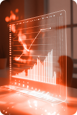
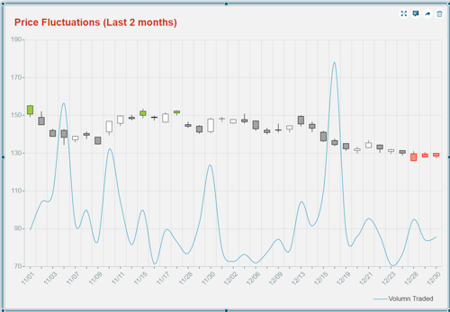
A Candlestick chart is a great tool to visualize, analyze, and predict the price movement and fluctuations over time for financial entities such as security, derivatives, currency, stock, bonds, commodities, etc. It is often used by traders, investors, finance brokers, and many others, to identify possible price movements based on past patterns and gauge the near-term direction of prices.
It represents information in the form of a candlestick pattern where the “candle-body” depicts the open and close price gap and the “candle-wick” depicts the high and low prices.
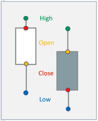
Generally, a green or white candlestick represents an uptrend movement, while a red or solid candlestick represents a downtrend movement.
Wyn Enterprise v6.1 supports the Candlestick charts with the Dashboards to let you analyze the financial data and understand the price actions.
Salient features of Candlestick Chart in Wyn Dashboard
- Easy to design and configure, by simply dragging and dropping the chart component on the design canvas and binding the data fields to built-in field areas available.
- Built-in support to add a Moving Average to the chart and be able to draw movement trends within the chart.
- Supports interactivity to drill down to another report or dashboard with details for a price pattern depicted by a particular candle in the chart.
- Configure and format the appearance of chart elements – axes, title, legend, and others, to match your company design standards or match other scenarios in the dashboard, with several configurable properties available in the Inspector panel.
- Setup filter for data based on the static data points or dynamic conditions.
- Conditionally highlight candles that match a specific target or fail to meet the required goal.
- Add text annotations to present instructions or notes related to the chart or the data plot, for your audience.
- Support generating code to embed the Candlestick chart scenario directly to your website (or webpage).
Use-case
Suppose you are the head of the Finance and Treasury department of a company and want to analyze the last two month’s price fluctuations of a commodity. You want to prepare a Candlestick chart to show the price movements and highlight the candles that are above and below a defined price target. You also want to see the volume of commodities sold and compare it with the pricing differences to understand the financial performance and profitability of the business.
Let’s see how we can achieve this business need using Candlestick Chart in Wyn Dashboard.
Creating Candlestick Chart in Wyn Dashboard
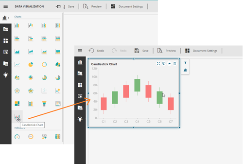
You can find the Candlestick Chart in the Charts section of the Data Visualization tab. Add it to the dashboard with a simple drag and drop from the panel to the design page.
Once the chart is there, navigate to the Data Binding panel and bind it to your dataset. Here, we bound it to a stock dataset with price state information – highest, lowest, opening, and closing prices of the commodity. Map this price information to the corresponding field area on the left of the Data Binding panel as shown below:
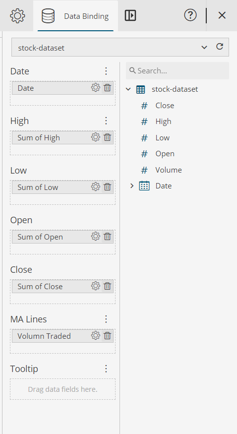
The next requirement is to see a trend for the volume of the commodity sold, with the changing prices So, we add the Volume data field to the MA (Moving Average) Lines. A rising moving average indicates an uptrend, while a declining moving average indicates a downtrend. You can also choose from among a line or scatter plot to see this trend.
Formatting and customizing the Chart’s Appearance
heck out the video below to watch the creation of this candlestick chart from scratch in the Wyn Dashboard. And for even more details, have a look at the user guide.

Paarisha Rana
As a software engineer, Paarisha enjoys the team environment of encouragement and learning. She enjoys reading, aerobics, travelling, and exploring historical places. Paarisha graduated from Uttar Pradesh Technical University (UPTU) at Lucknow (India) with a Bachelor’s of Technology in Information Technology, and you can find her on LinkedIn.


Loved by industry
experts and real users
Whether it’s your business or your commercial SaaS app, embed Wyn and empower users to design, share, and distribute interactive dashboards and reports.


