-
Interactive DashboardsCreate interactive BI dashboards with dynamic visuals.
-
End-User BI ReportsCreate and deploy enterprise BI reports for use in any vertical.
-
Spreadsheet AnalyticsNewLast-Mile Analytics Tool.
-
Narrative Data StoriesThe Next Evolution of Data Storytelling
-
Automated Business DocumentsNewDocument Generation for Smarter Workflows
-
Visual Data Pipeline BuilderDesign Complex Data Flows, Simply.
-
Wyn ArchitectureA lightweight server offers flexible deployment.
-
 Wyn Enterprise 7.1 is ReleasedThis release emphasizes Wyn document embedding and enhanced analytical express...
 -
 Choosing an Embedded BI Solution for SaaS ProvidersAdding BI features to your applications will improve your products, better serve your customers, and more. But where to start? In this guide, we discuss the many options.
-
Visual GalleryInteractive sample dashboards and reports.
-
BlogExplore Wyn, BI trends, and more.
-
WebinarsDiscover live and on-demand webinars.
-
Customer SuccessVisualize operational efficiency and streamline manufacturing processes.
-
Knowledge BaseGet quick answers with articles and guides.
-
VideosVideo tutorials, trends and best practices.
-
WhitepapersDetailed reports on the latest trends in BI.
-
 Choosing an Embedded BI Solution for SaaS ProvidersAdding BI features to your applications will impr...
 -

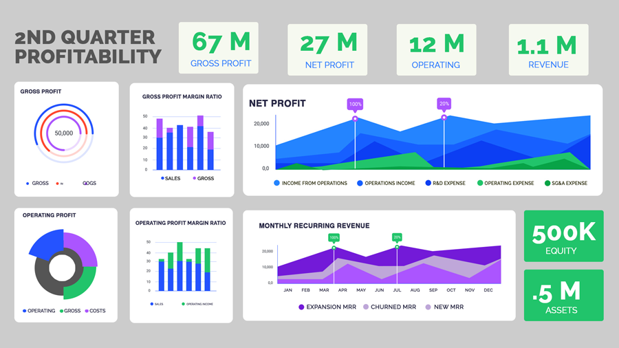
It is essential to track your financial performance to ensure the health of your business. If you’re tracking the key metrics, it can give you a picture of exactly where you are and what you need to do to meet your financial objectives. It’s challenging to look at reports and spreadsheets with rows and columns full of numbers and quickly figure out which metrics are essential and where they are compared to your goals.
With business intelligence dashboards for finance, managers in the financial industry can maintain a firm grasp of their current and past performance to develop more precise predictions to make data-driven decisions.
A CFO dashboard helps financial executives gain a real-time, consistent, and accurate view of financial data. With a real-time BI dashboard, you can track trends over the life of a project or a period, and easily track the impact of key events or strategies.
With a CFO dashboard you can track:
- Profit margin
- Operating profit
- Expenses
- Profits per region and location
Visualize critical financial measures such as:
- COGS
- Net sales
- Net profit
- Profit vs. spending per region
Using interactive BI dashboards, complex information becomes more clear, to a wider audience. Business intelligence (BI) offers end-users the ability to collect operational and financial information across the entire organization. The CFO can access this information through data visualizations that allow a more intuitive view of the whole business.
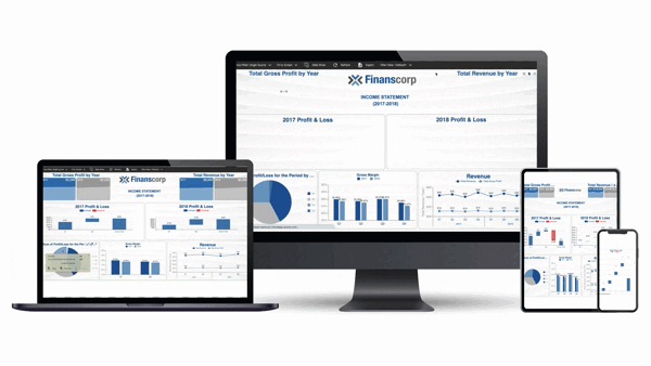
View examples of Business Intelligence Dashboards for Finance.
Evaluate your Financial Health with BI Dashboards
The number of KPIs you want to track can be endless with spreadsheets. You can generate information at a staggering level, which can be overwhelming.
Enterprise business intelligence solutions make the numbers come to life and give you an easy way to evaluate your financial health.
- Visualizing the data can be processed more quickly by your brain
- Easily show trends, patterns, and abnormalities
- Reveal insights that you might miss by just looking at the raw numbers
- Provide actionable information to manage your business
CFO Dashboards
Business intelligence dashboards help you visualize what’s going right and what needs more attention in your business.
To be successful long-term, businesses need to be profitable. We’ve seen lots of news stories about large companies that make a splash and churn through cash at a high rate. They aren’t profitable for years while growing their business. That’s fine as long as they do reach a point where they are profitable. If not, there comes a point where they can’t sustain the business or please the investors.
Profitability is crucial for measuring business success. While a growing company might not earn profits early on, it can still be a good investment if there’s underlying growth that can lead to profitability.
For established companies, a lack of profitability is a warning sign of trouble ahead.
For most businesses, they judge success based on two simple things:
- Is the business making a profit comparable (or better) than its competitors?
- Is the business growing?
Key Performance Indicators for CFO Dashboards
CFO dashboards deliver insights by grouping complementary or contrasting metrics. Therefore, the quality of the dashboard depends mainly on choosing the right metrics.
KPIs are ways to show a profit from a cash perspective. Here, we’ll overview the Gross Profit, Operating Profit, and Net Profit.
The Net profit is the most important as that’s how much money you’ll get to keep at the end of the day.
You should also turn these numbers into ratios to analyze performance more accurately. This helps you to measure efficiency.
For example, you may earn more money in one quarter but have higher gross profit margins in another quarter. This can help you to see the ratios and do a deeper dive to find out what’s driving this and whether there’s anything you can do to improve your performance overall.
Gross Profit Margin Ratio
If you’re selling goods, gross margins let you check your product profitability. In other words, how much it cost you to sell products. If your gross profit margin is high, it means you’re keeping a lot of profit relative to the cost. If it’s low, it represents thin margins and means you’ll need to keep all other expenses low, find more profitable product lines to sell, or raise your prices.
On a spreadsheet, your gross profit margin ratio may look fine from a numbers standpoint. Using an enterprise business intelligence solution to visualize this ratio may give you a completely different perspective. With customizable BI reports, you can adapt the way these margins are presented to align with executive or departmental needs.
Finance BI visualization is important is to show consistency. Gross margins should fluctuate dramatically over time. If you see significant spikes in either direction, you need to find out why.
Operating Profit Margin Ratio
Operating profit margin ratios show how efficient your business is. It demonstrates your company’s ability to convert sales into profits (pre-tax). While you want your gross profit margins on sales of goods to remain fairly consistent, you’re looking for an increase in operating profit margin ratios. This indicates a healthy company that’s growing.
When visualizing data, it’s much easier to see the comparative ratios and track them over time.
Net Profit Margin Ratio
This is the big picture, look at your profitability. It’s similar to the operating profit margin, but it also accounts for taxes. It’s the key indicator of how much profit you can expect after taking every business expense into account.
This is one of the key metrics you’ll want to benchmark yourself against other businesses in your industry. Visualization can add greatly to your understanding by tracking your net profit margin ratio over time and comparing it to industry averages in one easy-to-read graph. To make this proactive, you can configure data-driven alerts that immediately notify you when profitability ratios fall outside set thresholds.
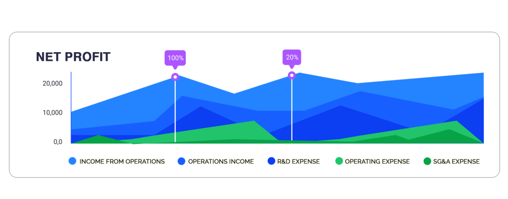
NET Profit Area Chart
Other Key Performance Indicators
Depending on your business structure and the type of model your business uses, there are three additional KPIs that you may find valuable to track and visualize:
- Monthly Recurring Revenue (MRR)
- Return on Equity (ROE)
- Return on Assets (ROA)
MRR (Monthly Recurring Revenue)
Monthly recurring revenue shows you how much money is coming in each month. It’s particularly useful for businesses that have subscriptions, service plans, or other ways that provide a steady income base as long as customers stick with you.
A healthy MRR provides a solid base for your company. If you can cover all your expenses with MRR, anything else you sell on top of that is profit.
You want to see steady growth in this area. If you see dips, it can be a warning sign that’s worth examining.
This can be visualized in several ways, including calculating the customer lifetime value (CLV) which can help you determine two things:
- How much you should spend on customer acquisition
- Future revenue projections
You’ll also need to factor in new customer rates, upgrades or downgrades, and churn rates when projecting future revenues.
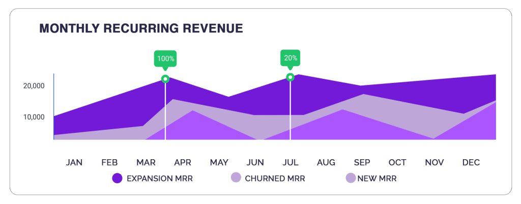
MRR Area Chart
ROE (Return on Equity)
Return on Equity measures financial performance to determine how effectively a business is using a company’s assets to create profit.
Your ROE is calculated by how you’re performing compared to others in your industry and other investment opportunities. In other words, are shareholders getting a strong return on their investment with your company rather than investing in the S&P 500, for example, which has averaged a 10% return since its inception through 2019.
This is another place where business intelligence dashboards (by visualizing these comparisons) can give you a better way to look at the information. Comparing your performance with your industry or other investment opportunities can show, at a glance, whether you’re performing well or trailing where you should be.
In publicly traded companies, this is one area that governing boards use to measure the performance of company leaders. It can also be used to project future growth rates (or lack of growth).
Bring Your Numbers to Life with Interactive Dashboards
Data visualization is a form of storytelling. Financial BI dashboards help quickly tell the story of what’s happening in your business at a glance. It can help you predict and capitalize on trends, reduce risk exposure, and strengthen your competitive advantage.

FAQ: Profit and Loss & CFO Dashboards
1. What is a profit and loss dashboard and how does it help organizations?
A profit and loss dashboard visually presents revenue, expenses, and net income data in real time. It helps organizations monitor financial performance, identify trends, and make informed decisions to maximize profitability and control costs.
2. How does a pnl dashboard improve financial reporting?
A P&L (profit and loss) dashboard enhances financial reporting by centralizing and automating the presentation of critical performance metrics. Instead of relying on static spreadsheets, finance teams gain a dynamic view of profitability, expenses, and margins. This reduces errors, saves time, and provides executives with instant insights to guide strategic decisions.
Key ways a P&L dashboard improves reporting include:
- Automated data collection: Eliminates manual entry and reduces errors.
- Real-time visibility: Provides up-to-date performance metrics at any time.
- Clear profitability tracking: Displays gross profit, operating expenses, and net margin in one place.
- Faster analysis: Enables finance teams to evaluate results instantly.
- Streamlined reporting: Simplifies the process of sharing financial insights with stakeholders.
- Better decision-making: Equips executives with accurate data to guide strategy.
3. What key metrics should be included on a CFO dashboard?
A CFO dashboard brings together the financial metrics that matter most for monitoring business health and guiding long-term strategy. By tracking both profitability and cash position, CFOs gain the visibility needed to balance growth with stability. The right mix of KPIs ensures informed decision-making and stronger alignment between financial performance and organizational goals.
Key metrics to include on a CFO dashboard:
- Revenue growth: Track overall business expansion over time.
- Operating margin: Measure efficiency in turning revenue into profit.
- Cash flow: Monitor liquidity to ensure smooth operations.
- EBITDA: Evaluate earnings before interest, taxes, depreciation, and amortization.
- Budget vs. actuals: Compare planned versus actual performance.
- Accounts receivable and payable: Manage incoming payments and outgoing obligations.
- Expense breakdowns: Analyze cost structures across departments or categories.
4. Can profit and loss dashboards be customized for different business needs?
Yes, modern BI tools let organizations tailor profit and loss dashboards with specific KPIs, custom visualizations, departmental breakdowns, and real-time data integration, ensuring alignment with unique business goals.
5. How does a CFO dashboard support proactive decision-making?
By consolidating financial and operational data in one place, a CFO dashboard provides instant visibility into trends, risks, and opportunities—enabling executives to react quickly and make data-driven decisions.
6. What are the benefits of using BI software for profit and loss reporting?
Using BI software for P&L reporting transforms static spreadsheets into interactive, real-time dashboards. Finance teams can consolidate data automatically, reduce manual effort, and present insights in a more visual and accessible way. This not only improves accuracy but also helps stakeholders understand financial performance at a glance and drill into details when needed.
Key benefits of BI software for P&L reporting include:
- Automated data consolidation: Eliminate manual gathering from multiple sources.
- Real-time analytics: Access the latest financial data instantly.
- Drill-down capabilities: Explore details behind revenue, expenses, or margins.
- Visual reporting: Use charts and dashboards to make data more understandable.
- Improved accuracy: Reduce errors linked to manual spreadsheet updates.
- Faster reporting cycles: Streamline financial reporting and save time.
- Better decision-making: Provide executives with timely, actionable insights.
7. How do dashboards help CFOs manage cash flow and liquidity?
Dashboards display real-time cash flow statements, working capital metrics, and payment cycles, allowing CFOs to monitor liquidity, identify bottlenecks, and take timely actions to maintain financial stability.
8. Are CFO dashboards secure and compliant?
Leading BI solutions offer robust security features—such as user authentication, role-based access, and audit trails—to ensure financial data privacy and compliance with industry standards.
9. Can dashboards integrate with existing accounting and ERP systems?
Yes, most modern CFO and P&L dashboards integrate seamlessly with accounting, ERP, and financial systems, enabling automated data updates and eliminating manual data entry.
10. Why choose Wyn Enterprise for CFO and profit and loss dashboards?
Wyn Enterprise delivers customizable, secure dashboards with unlimited user access and embedded analytics help finance teams and executives to monitor P&L, optimize performance, and drive business growth with actionable insights.

Laurie Smith
Laurie A. Smith is the Product Marketing Manager for Wyn Enterprise. She managed content development at the Developer Tools Division before moving to the Wyn Enterprise Business Intelligence Team. Laurie holds an MFA in Film and Digital Media Production from Chatham University, an MBA & a Master’s Degree in Journalism and Mass Communications from Point Park University in Pittsburgh, PA.
In addition to working in technology, she also loves beekeeping, the horror movie genre, and carefully cultivating sunflowers.
Find her on LinkedIn.


Loved by industry
experts and real users


