-
Interactive DashboardsCreate interactive BI dashboards with dynamic visuals.
-
End-User BI ReportsCreate and deploy enterprise BI reports for use in any vertical.
-
Spreadsheet AnalyticsNewLast-Mile Analytics Tool.
-
Narrative Data StoriesThe Next Evolution of Data Storytelling
-
Automated Business DocumentsNewDocument Generation for Smarter Workflows
-
Visual Data Pipeline BuilderDesign Complex Data Flows, Simply.
-
Wyn ArchitectureA lightweight server offers flexible deployment.
-
 Wyn Enterprise 7.1 is ReleasedThis release emphasizes Wyn document embedding and enhanced analytical express...
 -
 Choosing an Embedded BI Solution for SaaS ProvidersAdding BI features to your applications will improve your products, better serve your customers, and more. But where to start? In this guide, we discuss the many options.
-
Visual GalleryInteractive sample dashboards and reports.
-
BlogExplore Wyn, BI trends, and more.
-
WebinarsDiscover live and on-demand webinars.
-
Customer SuccessVisualize operational efficiency and streamline manufacturing processes.
-
Knowledge BaseGet quick answers with articles and guides.
-
VideosVideo tutorials, trends and best practices.
-
WhitepapersDetailed reports on the latest trends in BI.
-
 Choosing an Embedded BI Solution for SaaS ProvidersAdding BI features to your applications will impr...
 -

What is the Area Chart?
An area chart is a powerful data visualization that combines the precision of a line chart with the impact of a bar chart. It connects data points to display how values change over time or across categories, while shading the space beneath the line to emphasize volume. This visual style makes it easy to see both trends and total quantities at a glance.
In analytics and business intelligence, area charts are often used to track cumulative data, compare multiple data series, and reveal part-to-whole relationships. Whether you’re monitoring sales growth, website traffic, production output, or financial performance, the area chart helps viewers quickly spot increases, declines, and overall patterns. Modern pixel-perfect BI reports often embed area charts to ensure precision in both numbers and design.
In data visualization, an area chart is an extension of a line graph. It combines the line chart and the bar chart to reveal how one or more groups’ numeric values change over a second variable.
Unlike standard line charts, the filled area adds context to the magnitude of change, helping audiences interpret the scale of fluctuations more intuitively. This makes area charts an excellent choice for showing progress toward a goal, long-term trends, or seasonal variations in data.
An area chart is a great chart to visualize a volume change over a period of time. It gives a sense of summation of the quantitative data.
Data is plotted on the x- and y-axis. D values are plotted using data points that are connected using line segments. Unlike inline charts, the area between the line and x-axis is filled with color or shading in an area chart.
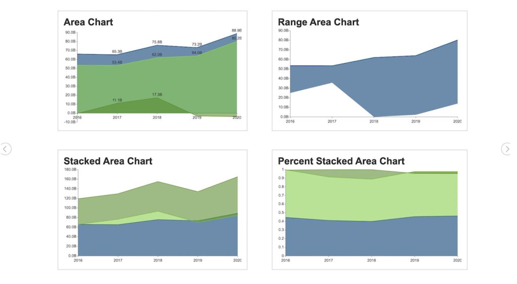
In Wyn Enterprise, you can create four types of area charts—Basic Area Chart, Stacked Area Chart, Range Area Chart, and Percent Stacked Area Chart—each designed for a specific type of analysis. Choosing the right version ensures your audience not only understands the numbers, but also the story behind them.
Area Chart Use Cases
Area charts are excellent when describing the overall trend, as opposed to the individual values. Use a stacked area chart for multiple data series with part-to-whole relationships or for cumulative series of values.
Say you have the quarterly sales data for five years. If you want to facilitate a general comparison for your audience, you will use a column or bar chart.
If you’re going to reveal the trend of how sales have changed over the years, you will use a line chart or an area chart.
Here, we’ll give an overview of each and describe how to create all four area charts in Wyn Enterprise.
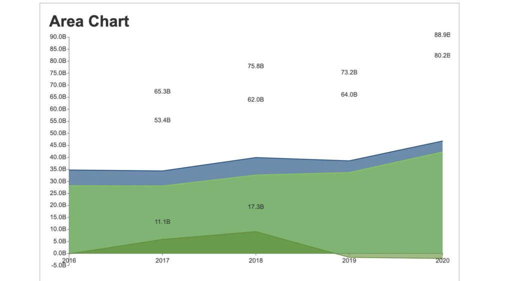
Basic Area Chart
The basic area chart is used to depict the data series as colored regions that help in comparing the values of multiple series for the same data point. This chart shows trends over time.
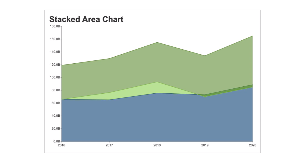
Stacked Area Chart
A stacked area chart depicts data series as stacked regions with different colors that help perform comparisons between multiple series for the same data point.
This chart shows the trend of the contribution of each value over time or other categorical data.
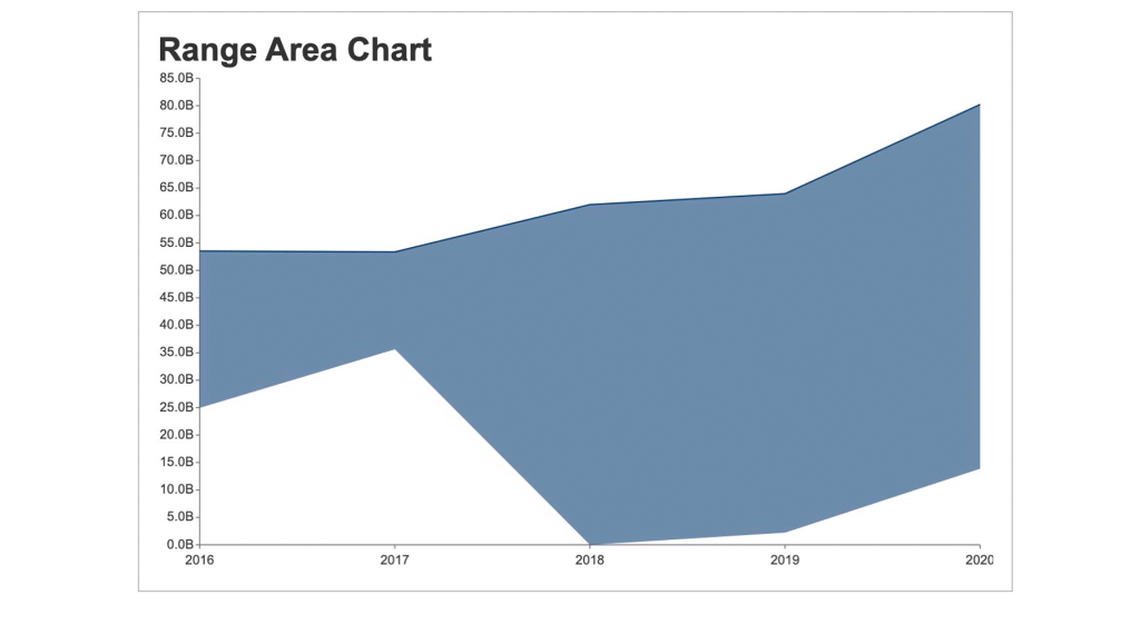
Range Area Chart
The range area chart is used to depict a range of data by plotting the area of two upper and lower values. This chart allows users to see the size difference between their data’s high and low values.
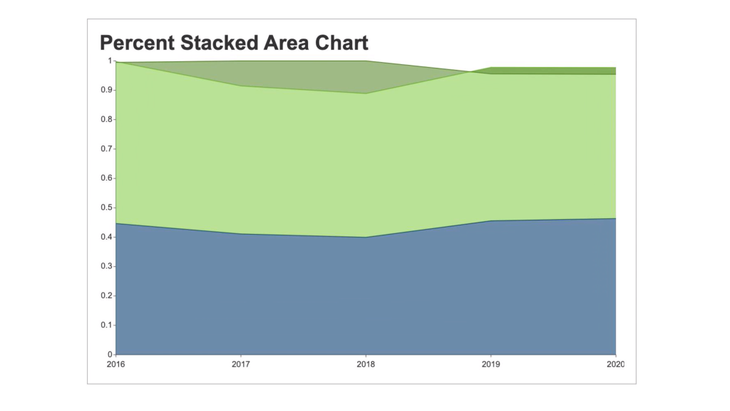
Percent Stacked Area Chart
A percent stacked area chart is used to depict the series of data points with positive and negative values shown overtime to reveal values of multiple series for the same data point.
This chart shows the percentage that each value contributes over time or other categorical data.
Creating Area Charts in Wyn Enterprise
Wyn Enterprise Dashboards have four kinds of Area charts: Basic Area Chart, Stacked area chart, Range Area Chart, and the Percent stacked area chart.
Here, we’ll show you how easy it is to create area charts in Wyn Enterprise. You can skip ahead chapters to individually view the steps for each chart type.
How to Create an Area Chart?
- From the Wyn Dashboard interface, select the visualizations icon.
- Click and drag the “Area Chart” onto the Dashboard canvas.
- Select the data binding tab. Under “Values” you will add the data you are comparing. Under Axis, add data for the x-axis.
- To adjust the design, select the Inspector Tab, next to the Data Binding tab. Here you can adjust the palette, text, and other design properties.
How to Create a Stacked Area Chart?
- From the Wyn Dashboard interface, select the visualizations icon.
- Click and drag the “Stacked Area Chart” onto the Dashboard canvas.
- Select the data binding tab. Under “Values” you will add the data you are comparing. Under Axis, add data for the x-axis.
- To adjust the design, select the Inspector Tab, next to the Data Binding tab. Here you can adjust the palette, text, and other design properties.
How to Create a Percent Stacked Area Chart?
- From the Wyn Dashboard interface, select the visualizations icon.
- Click and drag the “Percent Stacked Area Chart” onto the Dashboard canvas.
- Select the data binding tab. Under “Values” you will add the data you are comparing. Under Axis, add data for the x-axis.
- To adjust the design, select the Inspector Tab, next to the Data Binding tab. Here you can adjust the palette, text, and other design properties.
How to Create a Range Area Chart?
- From the Wyn Dashboard interface, select the visualizations icon.
- Click and drag the ” Range area chart” onto the Dashboard canvas.
- Select the data binding tab. Under “Values” you will add the data you are comparing. Under Axis, add data for the x-axis.
- To adjust the design, select the Inspector Tab, next to the Data Binding tab. Here you can adjust the palette, text, and other design properties.
In modern BI platforms, area charts also integrate with real-time BI alerts to notify stakeholders of critical thresholds directly on dashboards. With global teams, BI localization options ensure that these charts and alerts are accessible in multiple languages, supporting adoption across regions.
FAQ: Area Charts in Data Visualization
1. What is an area chart and when should it be used?
An area chart is a graphical representation that displays quantitative data over time, where the area between the line and the axis is filled in. It’s ideal for showing how values accumulate or compare across categories and is especially useful for visualizing trends and magnitude over time.
2. What are the main types of area charts?
The primary types include basic area charts, stacked area charts, percent stacked area charts, and range area charts. Each type serves a unique visualization need, such as comparing part-to-whole relationships, cumulative totals, or ranges of values.
3. What’s the difference between a line chart and an area chart?
While both display trends over time, an area chart fills the space below the line, highlighting the volume or magnitude of the values. This makes area charts more effective for emphasizing totals, part-to-whole relationships, or cumulative progress.
4. How do you interpret a stacked area chart?
A stacked area chart shows multiple data series stacked on top of each other. The height of each colored area indicates its value, and the total height shows the cumulative value. This format helps visualize both individual contributions and overall trends.
5. What are percent stacked area charts best for?
Percent stacked area charts are perfect for illustrating the proportional contribution of each category to the whole over time. Each data series is displayed as a percentage, making it easy to see shifts in distribution or dominance.
6. When is a range area chart the best choice?
Range area charts display two values per category, such as minimum and maximum, shading the area between. They’re especially useful for visualizing ranges (like temperature highs/lows or confidence intervals) and highlighting variability over time.
7. Can area charts be customized for color, style, or interactivity?
Yes, most modern BI and visualization tools allow you to customize area charts with various colors, transparency levels, gradients, tooltips, and interactive legends, ensuring your charts align with your data and branding needs.
8. What are best practices for designing clear area charts?
Use clear labels, consistent color schemes, and avoid clutter by not stacking too many series. Always include a legend and axis titles, and keep your design simple to ensure your audience can interpret the data quickly.
9. How can area charts help with business decision-making?
Area charts make it easy to spot trends, seasonal effects, and cumulative growth at a glance. By visualizing changes over time and comparing categories, businesses can identify opportunities, monitor performance, and make informed, data-driven decisions.
10. Are area charts suitable for all data sets?
Area charts work best with continuous, quantitative data and when comparing relatively few categories. They may not be ideal for large numbers of series, highly volatile data, or when data points overlap significantly.
11. How to Create a Basic Area Chart?
An area chart is a simple yet powerful way to highlight changes and magnitudes over time. It fills the space under a line graph, making it easier to see both trends and volume. Most BI and visualization tools allow you to build one quickly by following a few straightforward steps.
- Select your dataset: Use time intervals or categories for the X-axis and quantitative values for the Y-axis.
- Choose the chart type: In your BI or visualization tool, select “Area Chart.”
- Apply formatting: Adjust colors, labels, and gridlines for readability.
- Review the visualization: Confirm the area under the line is filled to emphasize trends or magnitudes.
- Customize as needed: Add legends, tooltips, or filters for deeper insights.
12. How to Create a Stacked Area Chart?
A stacked area chart displays multiple data series stacked on top of each other. To create one, organize your data with multiple series, then select “Stacked Area Chart” in your visualization tool. Each series will be colored and stacked, showing both individual and cumulative contributions across categories or time periods.
13. How to Create a Percent Stacked Area Chart?
A stacked area chart is useful for visualizing how multiple data series contribute to a whole over time or across categories. It layers each series on top of the previous one, making it easy to track both individual and cumulative values. Most BI and visualization tools include this option and require only a few steps to set up.
- Prepare your data: Organize it with multiple series aligned to the same categories or time periods.
- Select chart type: In your BI or visualization tool, choose “Stacked Area Chart.”
- Apply colors: Assign distinct colors to each data series for clarity.
- Check cumulative values: Ensure the stacking correctly reflects the total contributions.
- Customize the chart: Add labels, tooltips, or legends to improve readability and interpretation.
14. How to Create a Range Area Chart?
A range area chart is designed to show variability between two values, such as minimum and maximum, across categories or time. It highlights the spread by shading the area between the lower and upper boundaries. This makes it easy to spot fluctuations, trends, and outliers in your dataset.
- Prepare your dataset: Include two values per category (e.g., minimum and maximum).
- Select the chart type: In your BI or visualization tool, choose “Range Area Chart.”
- Map the values: Assign the minimum series to the lower boundary and the maximum series to the upper boundary.
- Check shading: Confirm the area between the two values is shaded to represent variability.
- Refine the chart: Add colors, labels, and tooltips to improve clarity and interpretation.

Laurie Smith
Laurie A. Smith is the Product Marketing Manager for Wyn Enterprise. She managed content development at the Developer Tools Division before moving to the Wyn Enterprise Business Intelligence Team. Laurie holds an MFA in Film and Digital Media Production from Chatham University, an MBA & a Master’s Degree in Journalism and Mass Communications from Point Park University in Pittsburgh, PA.
In addition to working in technology, she also loves beekeeping, the horror movie genre, and carefully cultivating sunflowers.
Find her on LinkedIn.


Loved by industry
experts and real users


