-
Interactive DashboardsCreate interactive BI dashboards with dynamic visuals.
-
End-User BI ReportsCreate and deploy enterprise BI reports for use in any vertical.
-
Spreadsheet AnalyticsNewLast-Mile Analytics Tool.
-
Narrative Data StoriesThe Next Evolution of Data Storytelling
-
Automated Business DocumentsNewDocument Generation for Smarter Workflows
-
Visual Data Pipeline BuilderDesign Complex Data Flows, Simply.
-
Wyn ArchitectureA lightweight server offers flexible deployment.
-
 Wyn Enterprise 7.1 is ReleasedThis release emphasizes Wyn document embedding and enhanced analytical express...
 -
 Choosing an Embedded BI Solution for SaaS ProvidersAdding BI features to your applications will improve your products, better serve your customers, and more. But where to start? In this guide, we discuss the many options.
-
Visual GalleryInteractive sample dashboards and reports.
-
BlogExplore Wyn, BI trends, and more.
-
WebinarsDiscover live and on-demand webinars.
-
Customer SuccessVisualize operational efficiency and streamline manufacturing processes.
-
Knowledge BaseGet quick answers with articles and guides.
-
VideosVideo tutorials, trends and best practices.
-
WhitepapersDetailed reports on the latest trends in BI.
-
 Choosing an Embedded BI Solution for SaaS ProvidersAdding BI features to your applications will impr...
 -

Wyn Enterprise now supports the ability for developers to create their own custom visualizations to use in WynDashboards. Developers can take advantage of our new visualization SDK to define the specifications of any custom visualization your enterprise requires to bring your data to life.
The series of in-house custom visualizations are built by our own team for public availability.
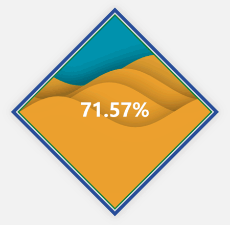
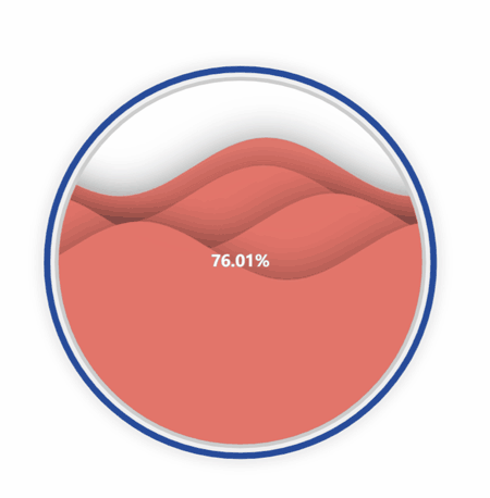
Wave Chart
The first custom visualization available for download is our aptly named “Wave Chart.”
This visualization allows you to show the percentage achievement of a target. However, this custom visualization is animated in such a way to show the visual’s shape filled with a “liquid,” which rises and falls based on the percentage achievement.
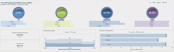
The below Overall Equipment Effectiveness (OEE) manufacturing dashboard is using the Wave Chart to visualize KPIs (overall equipment effectiveness, availability, performance, and quality).
Here, all of these KPIs are brought together into one interactive dashboard.
The Gantt Chart
The Gantt Chart is the newest data visualization in our custom collection.
A Gantt Chart is a bar chart that provides a visual view of tasks scheduled over a period of time. Gantt Charts are most commonly used in project management and are among the most popular and practical ways of showing activities (tasks or events) displayed against time.
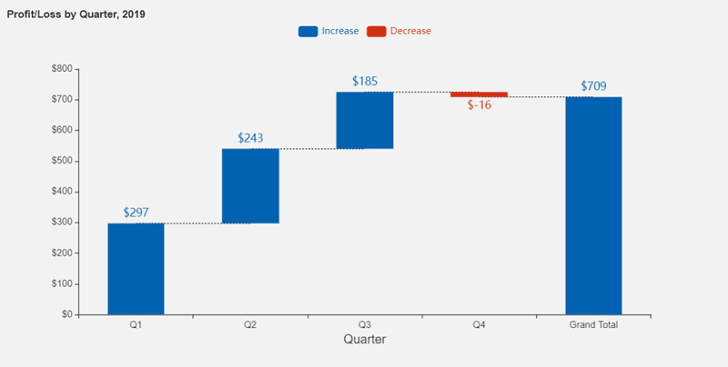
Waterfall Chart
Another custom visualization available for download is the Waterfall chart.
This visualization shows the cumulative result of sequential positive and negative values. Typically, these values are categorical or time-based. This visualization is often used in finance to show how NET values are calculated from a starting value.
Dashboard authors can use these custom visualizations as a fresh new way to bring their data to life. The Wave Chart and Waterfall can be used across any industry vertical, with any data that you would like to visualize.
To upload these to your own instance of Wyn Enterprise, simply upload the .viz file through the Resource Portal.
Download the visualizations here:
Running Wyn Custom Data Visualizations
The steps to run any of the custom visualizations will always be the same for running our publicly available custom visualizations:
- Install wyn-visual-tools globally. Run’ npm install @grapecity/wyn-visual-tools -g’ from the command prompt.
- Change the directory to the sample’s location and run ‘npm install’ to install all required modules.
- Run’ wyn-visual-tools develop’ to start the development server.
- Open the Wyn Enterprise portal in your browser. Go to the Admin Portal -> Dashboards Settings and enable developer mode.
- Go back to the Documents Portal and create a new dashboard. Then, add a “Dev Tools” scenario from the Custom Visualization tab on to the dashboard design surface.
- Develop your custom visualization using visual API. We recommend developing it using TypeScript.
- Click the Refresh button on the action bar of the Dev Tool visualization to reload the visualization.
To generate the .viz file:
- Update the version in package.json and visual.json before release.
- Pack the visual with build tools. Run’ wyn-visual-tools package’. This command will generate a file with “.viz” extension. This is the custom visualization which will be uploaded to Wyn.
- Upload the .viz file to Wyn Enterprise using the Resource Portal.
- The visual will now appear under Custom Visualizations in the Dashboard Designer.
Optional Steps:
- Edit visual.json to include some meta information about the visual.
- Edit capabilities.json to add configuration options around data binding, inspector properties, and action bar.
- Add i18n resource to i18nResources folder.
- Add image to the assets folder.
Understand the Story Behind Your Data
Wyn is a web-based BI and data analytics platform that provides greater insight into your data.
Wyn offers built-in tools for report and dashboard creation, data governance, security integration, embedded BI, automated document distribution, and a business-user-friendly interface for self-service business intelligence.

FAQ: Custom Visualizations for BI Dashboards
1. What are custom visualizations in BI dashboards?
Custom visualizations are tailor-made charts or graphics that go beyond standard BI dashboard options. They allow users to represent data in ways that best fit specific business needs, uncovering unique insights and enhancing decision-making.
2. Why should organizations use custom visualizations for their BI dashboards?
Custom visualizations help businesses highlight key trends, display complex data relationships, and tell compelling data stories. They improve clarity, engagement, and support faster, more informed decisions compared to generic chart types.
3. How can I create custom visualizations in a BI dashboard?
To create custom visualizations, use BI platforms that support plug-ins, extensions, or developer APIs. These tools let users design, code, and embed their own charts or widgets—fully integrated within existing dashboards.
4. What types of custom visualizations are commonly used in BI dashboards?
Common types include heatmaps, waterfall charts, bullet graphs, radar charts, Sankey diagrams, and advanced maps. These visuals address unique analytical needs not covered by default dashboard options.
- heatmaps
- waterfall charts
- bullet graphs
- radar charts
- Sankey diagrams
- advanced maps
5. Can custom visualizations be interactive?
Yes, custom visuals can include interactive features such as filtering, zooming, tooltips, and drill-downs, providing a more dynamic and user-friendly dashboard experience.
- filtering
- zooming
- tooltips
- drill-downs
6. Are custom visualizations mobile-friendly and responsive?
Leading BI tools ensure that custom visualizations adapt seamlessly to different devices and screen sizes, enabling effective analytics on desktops, tablets, and smartphones.
7. How do custom visuals improve data storytelling?
Custom visuals allow you to design charts that directly match your narrative, emphasizing the most important trends and guiding viewers through complex data stories for better engagement and understanding.
8. What skills are needed to build custom BI dashboard visualizations?
Depending on the BI platform, users may need experience with JavaScript, D3.js, or other data visualization libraries. Wyn Enterprise offers documentation and sample code to assist developers and analysts.
- JavaScript
- D3.js
- other data visualization libraries
9. Can custom visualizations be shared and reused across dashboards or teams?
Yes, most BI platforms support sharing and reusing custom visuals by saving them as templates or plugins, streamlining collaboration and standardizing analytics across departments.
10. Why choose Wyn Enterprise for creating custom BI visualizations?
Wyn Enterprise provides robust developer tools, a flexible plug-in framework, and detailed documentation. Together, these make it easy to build and embed custom visualizations, enabling organizations to deliver highly tailored, interactive analytics within their dashboards.

Ethan Conner
As a Technical Account Manager w ith the Wyn Enterprise team, Ethan loves the collaborative, team-oriented culture. In his spare time, he enjoys playing guitar and drums, learning new technologies, and reading. You can find him on LinkedIn.


Loved by industry
experts and real users


