-
Interactive DashboardsCreate interactive BI dashboards with dynamic visuals.
-
End-User BI ReportsCreate and deploy enterprise BI reports for use in any vertical.
-
Narrative Data StoriesThe Next Evolution of Data Storytelling
-
Visual Data Pipeline BuilderDesign Complex Data Flows, Simply.
-
Wyn ArchitectureA lightweight server offers flexible deployment.
-
 Wyn Enterprise 7.1 is ReleasedThis release emphasizes Wyn document embedding and enhanced analytical express...
 -
 Choosing an Embedded BI Solution for SaaS ProvidersAdding BI features to your applications will improve your products, better serve your customers, and more. But where to start? In this guide, we discuss the many options.
-
Visual GalleryInteractive sample dashboards and reports.
-
BlogExplore Wyn, BI trends, and more.
-
WebinarsDiscover live and on-demand webinars.
-
Customer SuccessVisualize operational efficiency and streamline manufacturing processes.
-
Knowledge BaseGet quick answers with articles and guides.
-
VideosVideo tutorials, trends and best practices.
-
WhitepapersDetailed reports on the latest trends in BI.
-
 Choosing an Embedded BI Solution for SaaS ProvidersAdding BI features to your applications will impr...
 -

Portfolio management is a complex and strategic financial function. It requires making information-driven decisions, matching investments with financial objectives, and reducing monetary risk by diversifying investments in your stock portfolio.
A portfolio analysis studies the investment portfolio to determine its appropriateness for an investor’s needs, preferences, and resources. This type of stock portfolio analysis is essential for effective stock portfolio management and supports smart decision-making using investment charts and clear investment portfolio reporting.
Investors visualize data to:
- Determine financial objectives and investment durations for their stock portfolio
- Select investment options and build a diversified stock portfolio
- Monitor the performance of investments via investment charts, portfolio charts, and ongoing investment portfolio reporting
Using Financial KPIs to Maximize Your Portfolio
A portfolio’s overall performance is impacted by a number of external factors. KPIs are a selection of the most important, quantifiable metrics used to measure key aspects of your stock portfolio management. They allow you to track the value of various investments and observe how they respond to changes in volatile markets.
Embedded business intelligence tools allow investors and managers to customize business intelligence dashboards with investment portfolio reporting catered to the specific industry, fund type, or performance goals. BI dashboards allow investors to drill down metrics to better understand specific industry trends in different sectors over various periods of time.
View our interactive dashboard gallery→
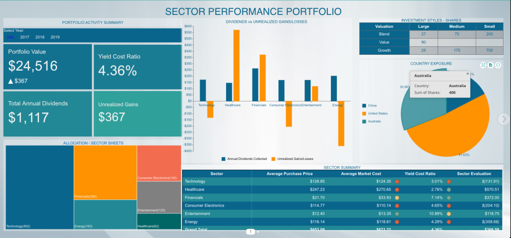
Stock Portfolio BI Dashboard
Data Visualizations for Portfolio Management
Here, we’ll take a look at a portfolio management dashboard and offer tips on the best data visualizations to use for your portfolio data visualization.
View the interactive Portfolio Management dashboard and see how stock portfolio charts can support your investment strategy.
Line Charts
A line chart helps investors to spot the trends and/or highlight the price/stock movement over time. The X-axis, almost every time, represents the time period and the Y-axis represents the stock price. Investment charts like this are essential for visualizing the performance of your portfolio.
Column Charts
A column chart is helpful in displaying the categorical data for your portfolio. A portfolio chart with varying column heights/widths helps in comparing two categories of the data. The chart also helps in spotting historical highs and lows and identifying trends.
Pie/Donut Charts
The pie chart displays the relationship between a category of data. Pie charts can help show percentages and sizes of different categories in your stock portfolio, but they can be ambiguous when representing data when there are many categories and many varying data points. If there were more values to display, the pie chart could easily and logically be converted to a bar chart or treemap.

KPI/KPI Cards
The KPI cards are visualizations and expansions on the KPI Chart. With KPI Cards, users can display KPI’s with values and have the option to display a bar, line, or area chart in the card. This visualization enables users to display KPIs from separate quarters, years easily, or any measure they would like to display in their stock portfolio analysis. KPI cards are helpful in providing indicators for a quick look into the performance of the portfolio before proceeding to the details.
Examples include allocation, yield cost ratio, annual dividends, and unrealized gains.
Data Table/Pivot
A table displays the performance of one’s portfolio, identifies the sector(s) that has a good or bad yield, without requiring in-depth comprehension.
Based on these numbers, the portfolio stakeholder(s) can do external research into the specific sectors to gain better insight to advise their investments.
Portfolio Value
The annual measure of returns on investments. The value displays the profits and losses yielded on the total stocks purchased. Portfolio value is determined by data pulled from several financial sources.
A line chart/column chart can show the portfolio value over a period of time.
You can view the entire interactive dashboard here.
Treemaps
A treemap can display the category/sector in which a user is holding stocks. A Treemap has the advantage of showing extensive aggregated hierarchical data in less space. A user can quickly spot the proportion/size of a data category using treemap.
The disadvantage of a treemap is that the user struggles to view a category as the data becomes closer to zero.
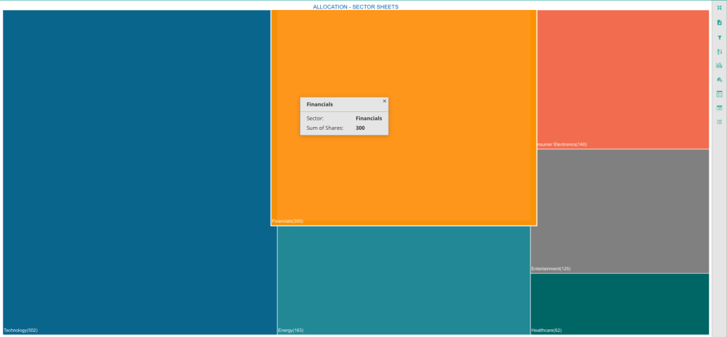
Treemap Visualization
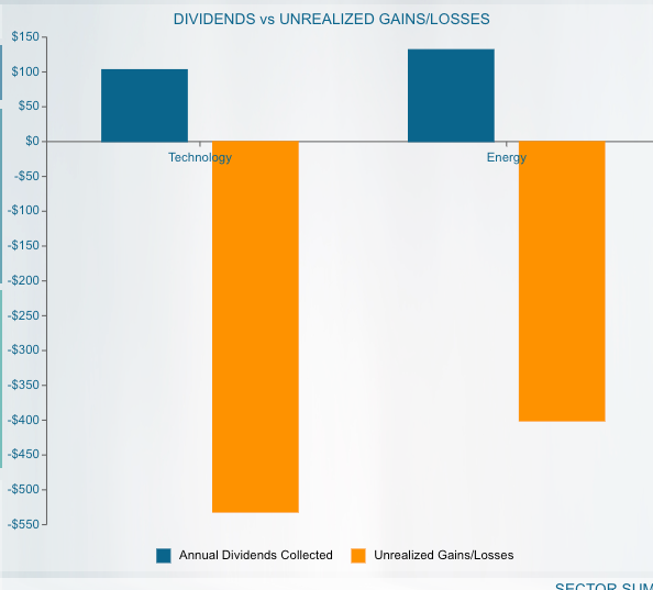
Dividends vs Unrealized Gains
The bar chart displays the relationship between dividend yield and unrealized gains/losses.
An unrealized gain or loss shows when the value of the stock increases or decreases after being purchased, but before the investor sells the stock. In other words, it is a profit or loss that exists only on paper.
The most important items to look at in this particular chart are those which provide high dividends and low unrealized gains and vice versa. The portfolio manager then makes an informed decision to either sit on a pile of unrealized gains/losses or buy/sell the stock to help rebalance the number of shares with greater yield.
Allocation
Diversity is fundamental to a successful portfolio, and understanding how the pieces fit together is equally important. A treemap visualization shows clearly that this investor’s portfolio has the highest quantity of stock in the technology sector, the largest block. The data can be shown as a column or line chart as well. A stacked area chart can also be considered.
When these sectors are further broken out, it is possible to contextualize short-term fluctuations within historical trends. This helps investors implement and maintain a viable long-term plan.
Interactive dashboards let investors compare multiple data sets across sectors, countries, growth types, and risk types. Combining graphical representations of several data sets lets users simplify comparative analysis and find different patterns and predictive economic indicators.
Sector Summary Tables
The Sector Summary table presents figures for financial advisors and portfolio managers. The table provides high-level visual indicators that help investors identify sectors with good or bad yields.
Based on these numbers, the portfolio stakeholder(s) can do external research into specific sectors and gain better insight to advise their investments.
The data used in this table can be pulled into dynamic stock charts that provide users with information on any publicly-traded company within a specific sector.
The ability to examine individual companies for potential gains and losses allows investors a more granular view of their portfolios and may help them determine how to invest within various sectors.
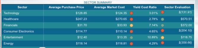
Sector Summary Table
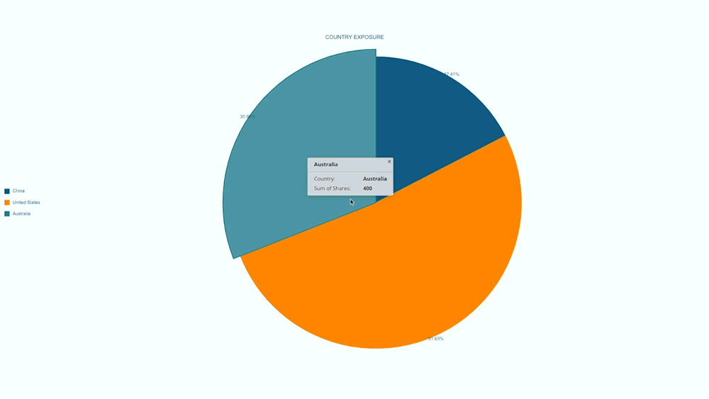
Country Exposure
This pie chart shows how investments are allocated across locations. Investors can monitor how much of their money is tied to a particular economy and adjust accordingly.
A pie chart is an ideal visual to be used when it comes to displaying categorical data where every single slice shows a specific category, but they can be ambiguous when representing many categories and numerous varying data points.
The pie chart makes sense to use for this specific visualization since there are only three values to display. If there were more values or zero values to display, this pie chart could easily and logically be converted to a bar chart or treemap.
Investors can monitor how much of their money is tied to a particular economy and adjust accordingly.
Dashboards also let users compare investment performance in established and emerging markets and use those numbers to inform their own geographical allocation. These features used in combination allow investors to prepare for changes in the global economy.
Investment Style
An investment-style box is a method that categorizes the stock on the basis of market capitalization and valuation. This chart helps the investor evaluate the diversification of a portfolio, and balance between the potential risk and return. For example, large-cap and blendstocks tend to be less volatile, and therefore less risky.
Conversely, small-cap and growth stocks carry greater risk as a result of higher volatility.The horizontal axis on this chart reflects the market cap. The vertical axis categorizes the stock by valuation.
Balancing risk types is an important subset of allocation. Visualizing this data alongside other diversification indicators allows users to better assess risk across different sectors.
Share Real-Time Insights with Wyn Dashboards
With Wyn Enterprise, you can create interactive dashboards and share them securely in real-time. These stock portfolio charts help stakeholders quickly see the current state of investments and track changes as markets shift.
Scheduled pixel-perfect BI reports ensures everyone stays up to date, and the ability to export or automate these reports saves valuable time.
Get Started with Portfolio Management BI
Ready to transform your approach to stock portfolio management? Business intelligence platforms like Wyn make it simple to analyze, visualize, and report on portfolio data—all in one place.
Try building your own investment charts and dashboards to unlock the full power of your investment data.
Data Security in Portfolio Management
When it comes to financial information, security is essential. All investment portfolio reporting must be handled with strong security measures to protect confidential data and comply with industry regulations.
Benefits of Embedded BI for Portfolio Management
By embedding BI capabilities directly into your workflow, you can provide users with real-time BI alerts, portfolio data visualization and up-to-date analytics. This not only streamlines decision-making but also empowers your team with enhanced stock portfolio management capabilities.
Customization for Different User Roles
Customizable stock portfolio charts make it easy for different stakeholders to get the specific insights they need. Whether it’s executives wanting a high-level overview or analysts requiring deep dives, BI dashboards cater to every role.
Automating Portfolio Reports
Automating routine reports with investment charts saves time and eliminates manual errors. Users receive timely updates, and analysts can focus on more strategic tasks rather than repetitive data pulls.
Case Study: Sector-Based Analysis for Better Results
A large investment firm implemented sector-based dashboards for their clients. By focusing on stock portfolio analysis at the sector level, they were able to quickly identify outperforming and underperforming areas, improving both client satisfaction and portfolio returns.
Conclusion: The Future of Portfolio Visualization
Modern BI tools make it possible to visualize your entire portfolio chart in real time, unlocking new opportunities for analysis and action. By embracing technology, investors gain a deeper understanding of their stock portfolio and make more informed decisions.
FAQ: Stock Portfolio Visualization & Analysis
1. What is the best chart to spot trends and highlight price or stock movement in a stock portfolio?
The best chart for spotting trends and highlighting the price or stock movement within a stock portfolio is the line chart. Line charts present changes over time, allowing you to see how prices evolve daily, weekly, or over any chosen period. They are essential for understanding momentum, identifying growth opportunities, and performing clear stock portfolio analysis.
2. How can column charts be used in stock portfolio management?
Column charts are highly effective in stock portfolio management for comparing categorical data, such as returns from different sectors or assets. They visually represent performance across various investment classes, making it easy to spot historical highs and lows or to identify outperforming stocks at a glance. This makes them valuable for informed decision-making.
3. When should I use a pie chart or donut chart in my portfolio data visualization?
Pie charts and donut charts are excellent for portfolio data visualization when you want to show how your stock portfolio is allocated across different sectors, asset classes, or holdings. They help investors understand diversification and relative weightings within their portfolio, although they work best with a limited number of categories for clear readability.
4. What is a portfolio chart and why is it important for investors?
A portfolio chart is a visual tool that aggregates various data points from your stock portfolio, such as performance by sector or asset class. It helps investors monitor diversification, spot imbalances, and make data-driven decisions. Portfolio charts are crucial for keeping an eye on overall investment health and making necessary adjustments.
5. How do KPI cards enhance investment portfolio reporting?
KPI cards are a dynamic way to highlight key performance indicators in your investment portfolio reporting. They present crucial data like allocation, annual dividends, or risk ratios at a glance. These cards simplify complex metrics, allowing investors and managers to track portfolio goals and results with minimal effort.
6. What role do investment charts play in stock portfolio analysis?
Investment charts are essential for effective stock portfolio analysis. They visualize data trends, correlations, and performance metrics across your investments, enabling better understanding of returns, risk, and market behavior. With clear investment charts, you can identify strengths and weaknesses in your portfolio and take action accordingly.
7. Why is real-time reporting valuable in stock portfolio management?
Real-time investment portfolio reporting is invaluable for stock portfolio management because it delivers up-to-the-minute data. This ensures that you and your stakeholders always have access to the latest performance figures, risk exposures, and opportunities. Real-time insights support faster, more confident decision-making in volatile markets.
8. How does portfolio data visualization improve investment outcomes?
Portfolio data visualization transforms complex financial data into intuitive, interactive visuals. This approach empowers investors to quickly interpret trends, correlations, and sector performance within their stock portfolio. As a result, it leads to smarter allocation, better risk management, and ultimately stronger investment outcomes.
9. What security measures are important in investment portfolio reporting?
Security is crucial in investment portfolio reporting to protect sensitive financial information. Use platforms that offer robust encryption, secure sharing options, and user authentication. This not only ensures compliance with industry regulations but also builds trust with clients and stakeholders managing their stock portfolio.
10. How can automating portfolio reports benefit my investment workflow?
Automating portfolio reports with BI tools and investment charts streamlines your investment workflow. It eliminates manual data entry, reduces errors, and ensures timely delivery of performance updates. Automated reports keep all stakeholders informed and allow analysts to focus on higher-value portfolio analysis and strategy development.

Nitin Gupta
Nitin Gupta has experience working in several roles with the organization, ranging from technical support to sales. Nitin is now working towards a Product Manager role. He is a business management graduate from ICFAI. In his free time, Nitin enjoys open-wheel racing & binging on short films. You can connect with him on Twitter.


Loved by industry
experts and real users